UCA Open Day Website Redesign
The University for Creative Arts Open Day website was difficult for students to navigate, making it hard to find courses and register. We designed a simplified, grid based microsite with a playful look to make finding information easier and improve the booking experience.
UCA's Open Day website was losing prospective students before they could book a visit. Complex navigation, text-heavy pages, and a confusing booking flow made the digital first impression work against enrollment. I led UX for a team of 4 to redesign the discovery to booking experience creating UCA's first grid-based microsite that reflects the university's creative identity while making course discovery and visit booking effortless.
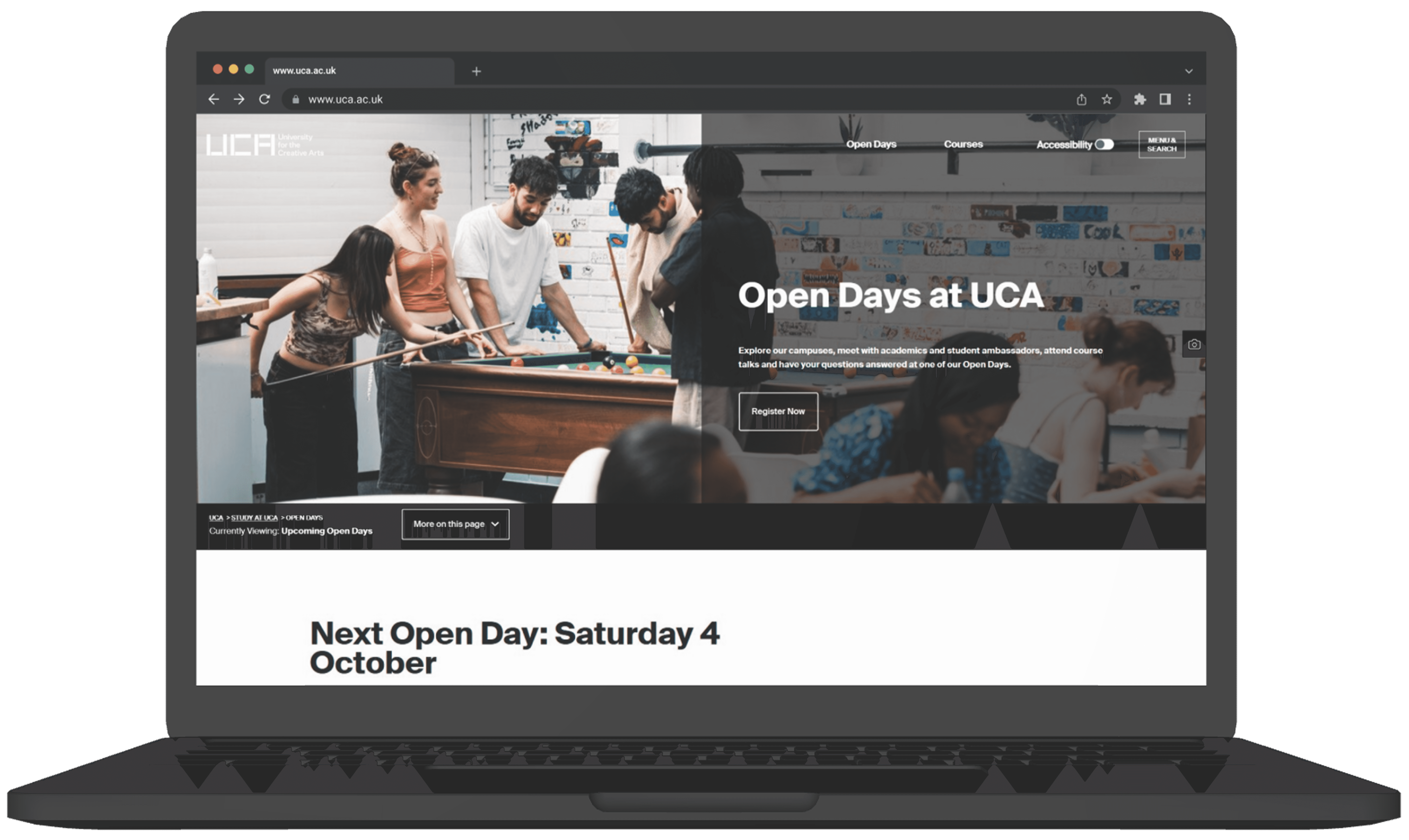
UCA's Open Day website was working against the university it represented. Prospective students arrived curious and left confused unable to find their course, unaware other campuses existed, and frustrated before they ever reached the booking page.
How might we redesign the Open Day experience so that a prospective student can discover their course, explore the campus, and book a visit without getting lost or giving up?
Three core problems drove the redesign:

70%
Reduced time spent and user confusion, helping them to find Open Day details faster during testing.
65%
Boosted user engagement with clearer CTAs and an organised flow, making users feel more encouraged and likely to register for an Open Day.

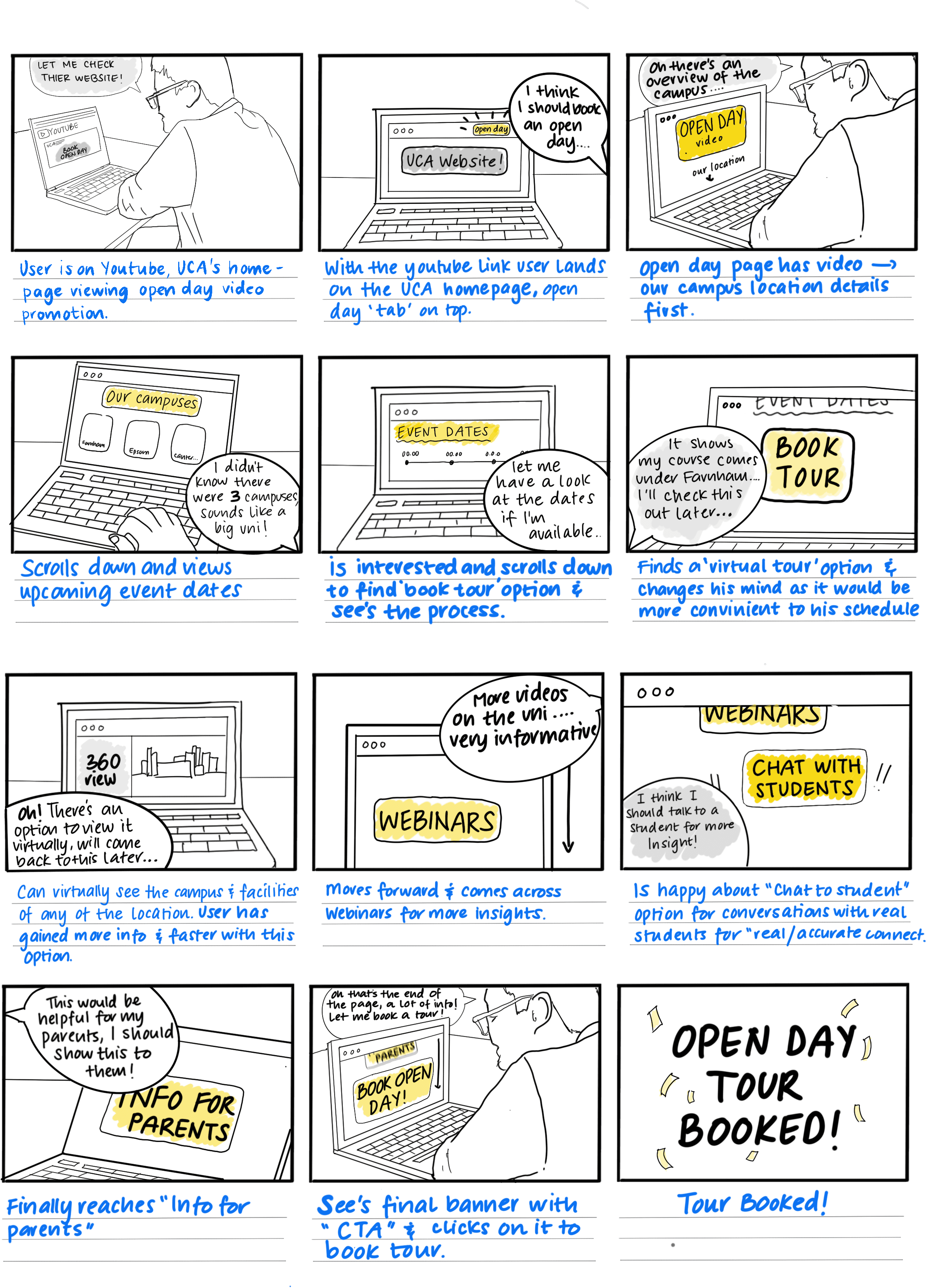


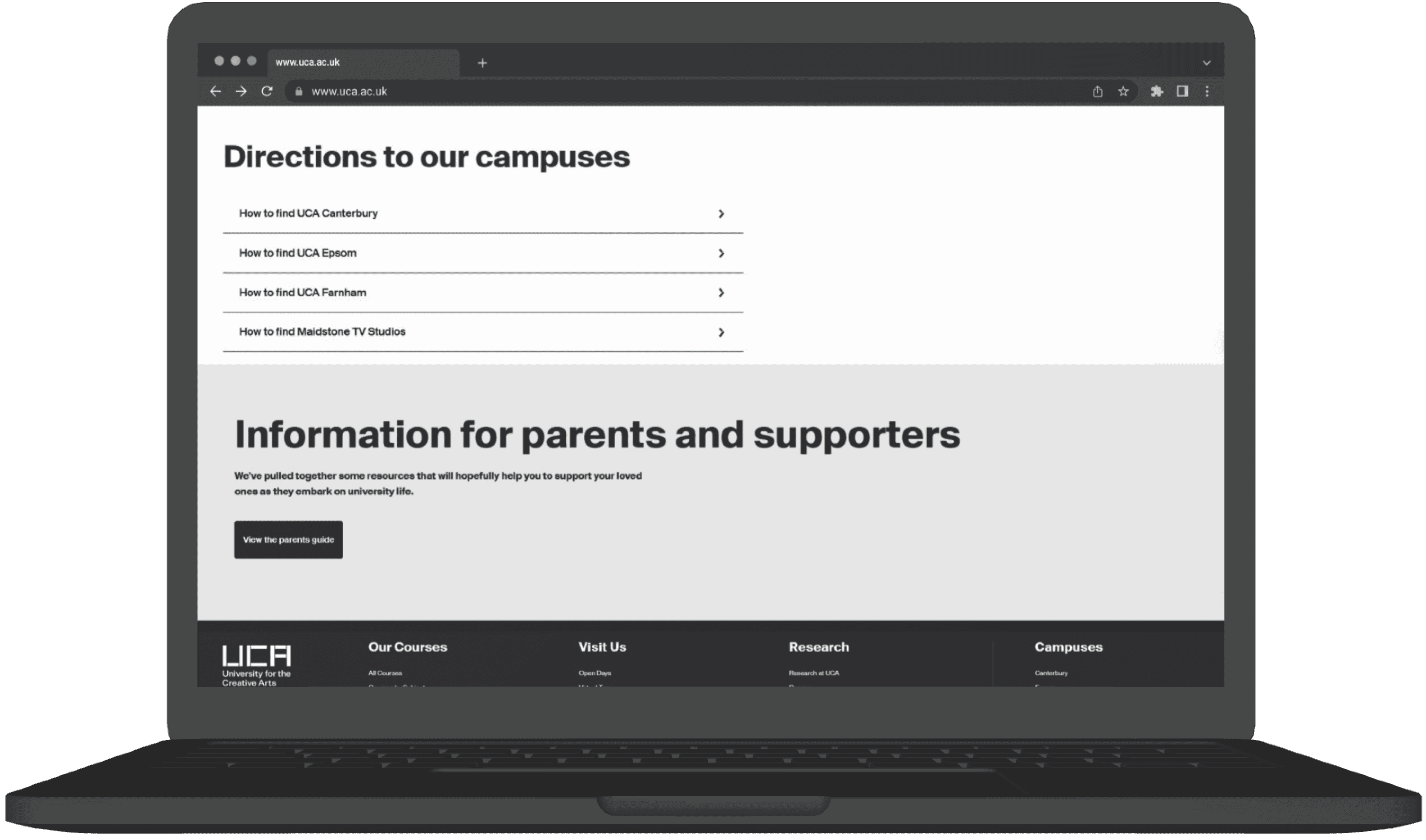


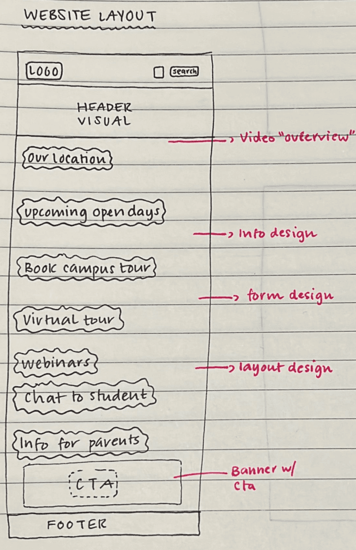
With three clear problem areas identified, I restructured the information architecture around what users actually came to do.
Priority order: course discovery → campus exploration → visit booking.

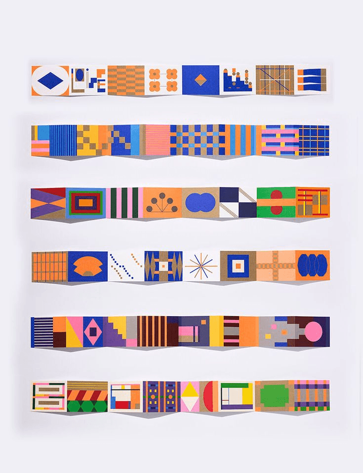
Moodboard
We explored a range of themes, from minimalistic to playful, to identify a style that best represents UCA's identity. This process ensured a balance between creativity and functionality, aligning the design with the university's unique character and appeal.
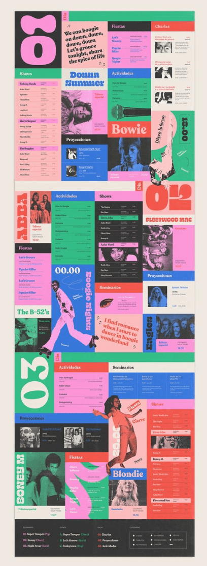
Branding
We finalized a playful theme with bright colors, as it best captures UGA's vibrant and creative identity, reflecting the university's essence. This theme not only aligns with UCA’s dynamic and artistic spirit but also ensures an engaging and visually appealing experience for users.
After exploring 8-10 fonts and discussing their emotional impact, we finalized BD Supper for headings and Space Grotesk for body text. These fonts, with their varied heights and weights, create a clear hierarchy while perfectly captures UCA's structured yet creative essence.
Typography
Space Grotesk
(Body)
BD Supper
(Heading)
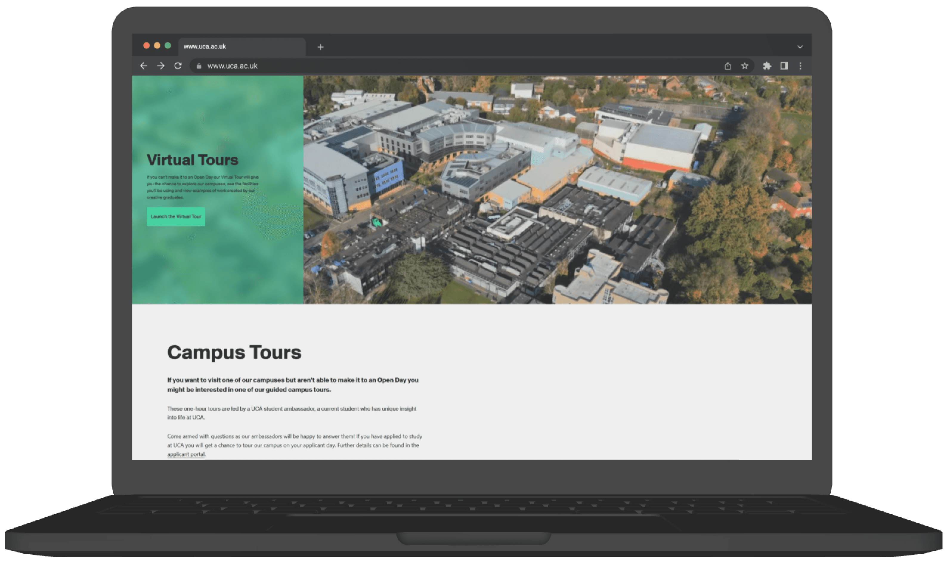
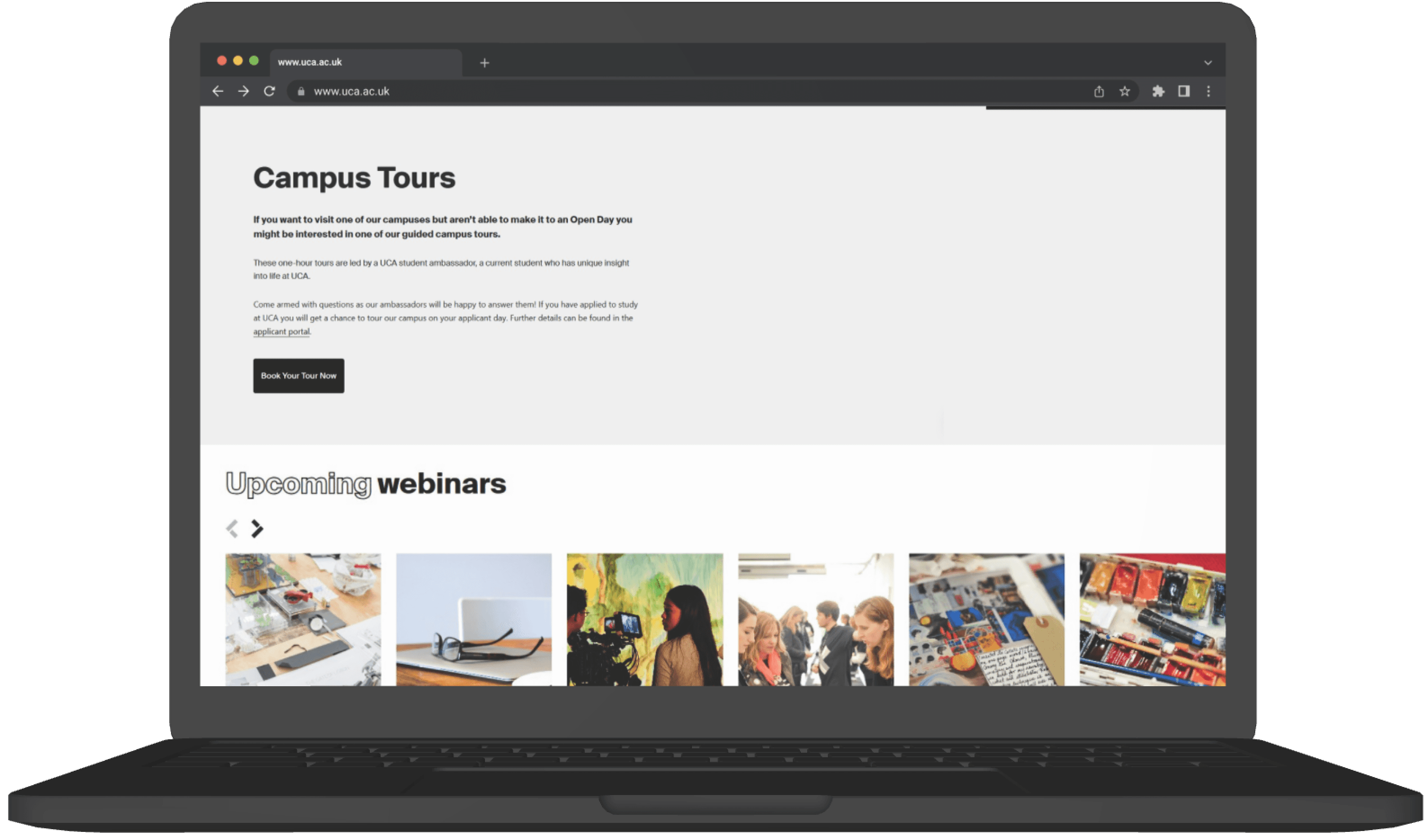
CAMPUS TOUR
If you want to visit one of our campuses but aren't able to make it to an Open Day you be interested in one of our guided campus tours.
Colours
Darker Accents
Lighter Accents
Primary Colors
Neutral Colors
Imaginative
Discovery
Future focused
Experimental
Infinity
Icons
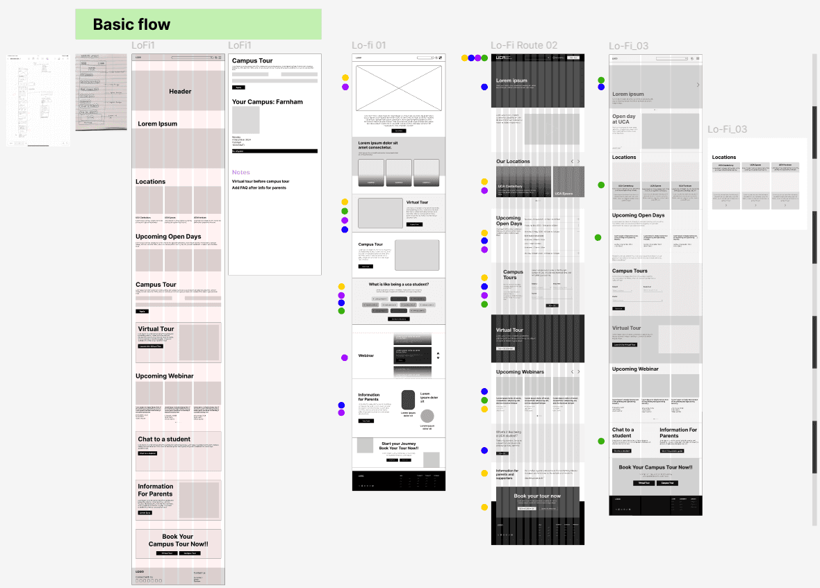
Lo-fi Options
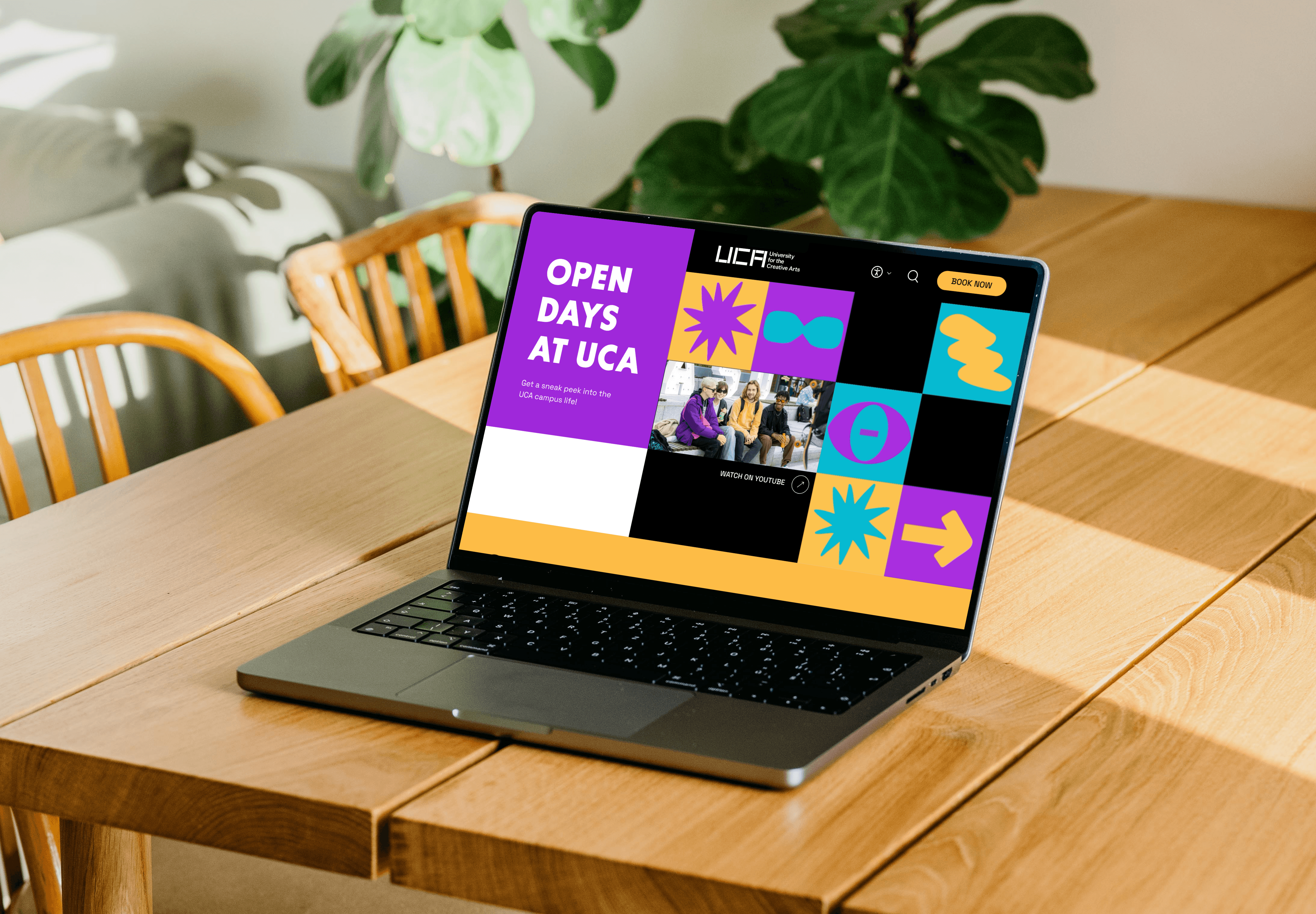
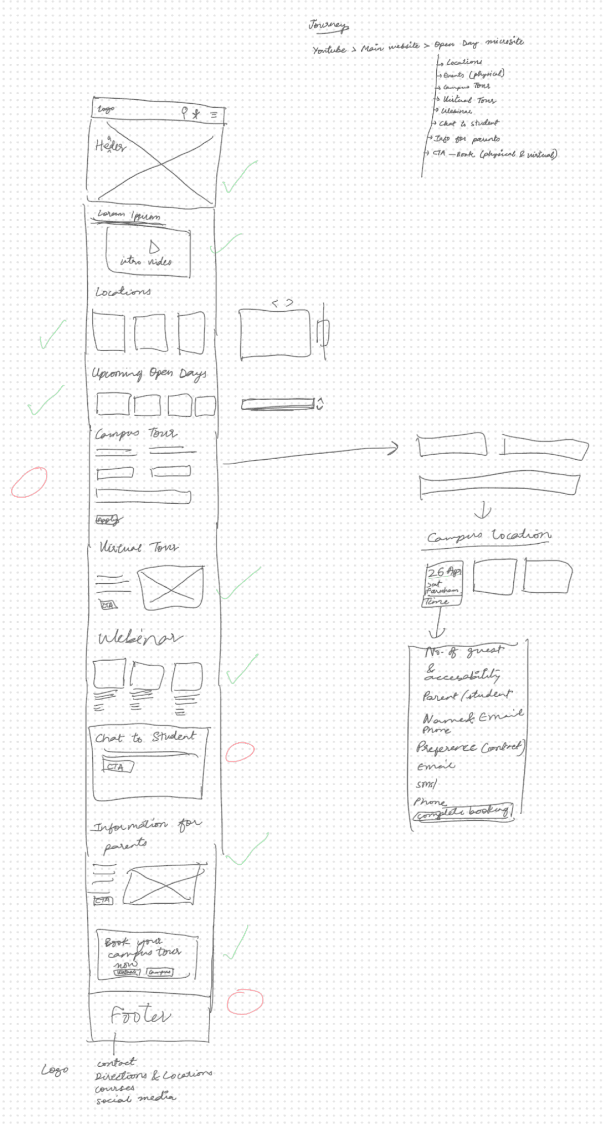
Created three distinct lo-fi directions, each organizing the same content differently testing whether users responded better to a list-based layout, a grid-based layout, or a card-based layout.
Testing with students revealed a clear winner and two key iterations:
What worked - the grid layout was immediately scannable. All three users found course information faster than in the other two options.
What didn't - 2 of 3 users still couldn't complete the booking flow in round one. The CTA wasn't prominent enough and the steps felt disconnected.
What changed - I moved the booking CTA above the fold, reduced visible steps from 5 to 3, and added a progress indicator. In round two, all three users completed the booking without prompting.
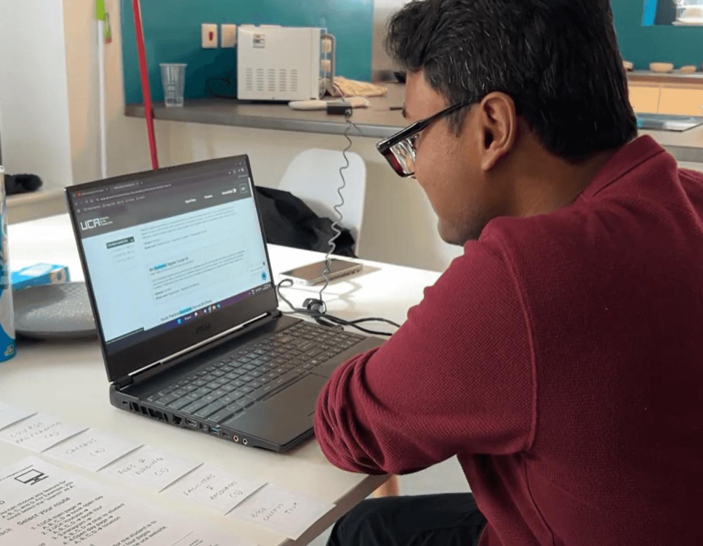
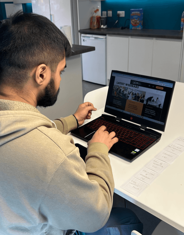
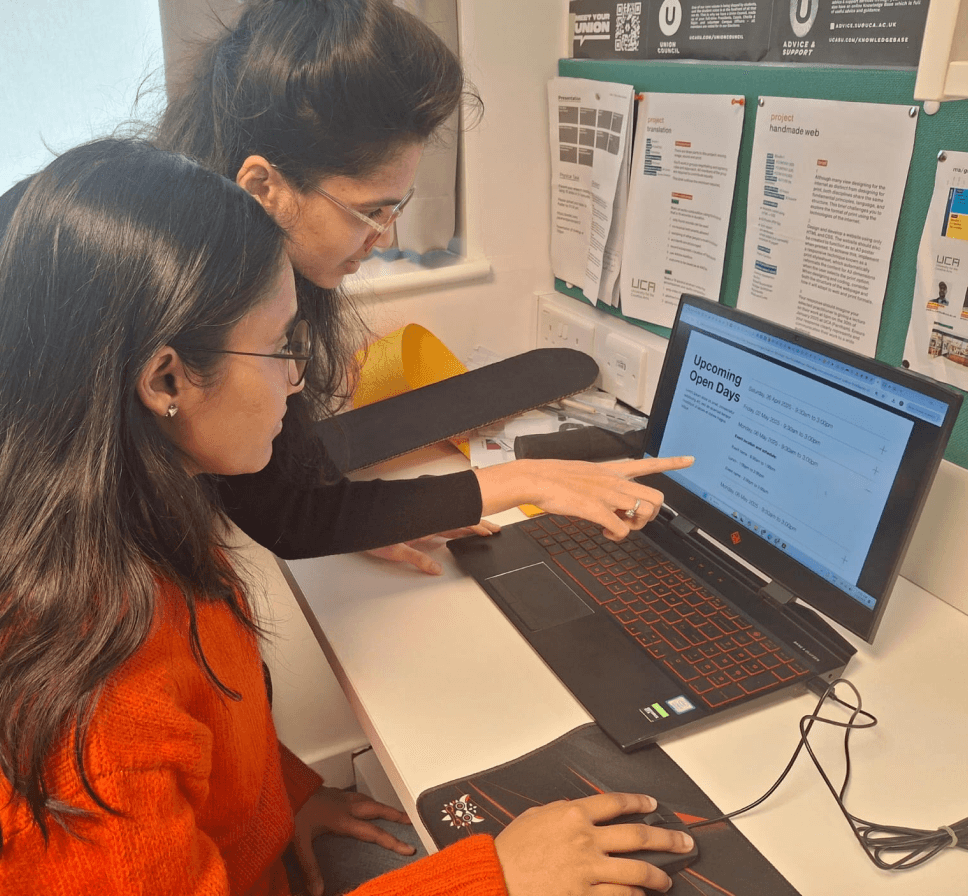
User Testing
We tested our Open Day prototype with three students to gather real-time feedback on clarity, navigation pattern, and overall usability. Their insights helped us identify what worked well and where improvements were needed. Overall, the feedback was positive, and the small changes made the design feel more intuitive, clear, and easier to use.

User 1
User 2
User 3
Who I tested with?

Prototype & Iterate
I translated two rounds of testing into a hi-fi prototype iterating on navigation labels, booking flow, and visual consistency until every task could be completed without prompting.
Click in the frame once to start interacting, press 'R' to return to the homepage.
Outcome
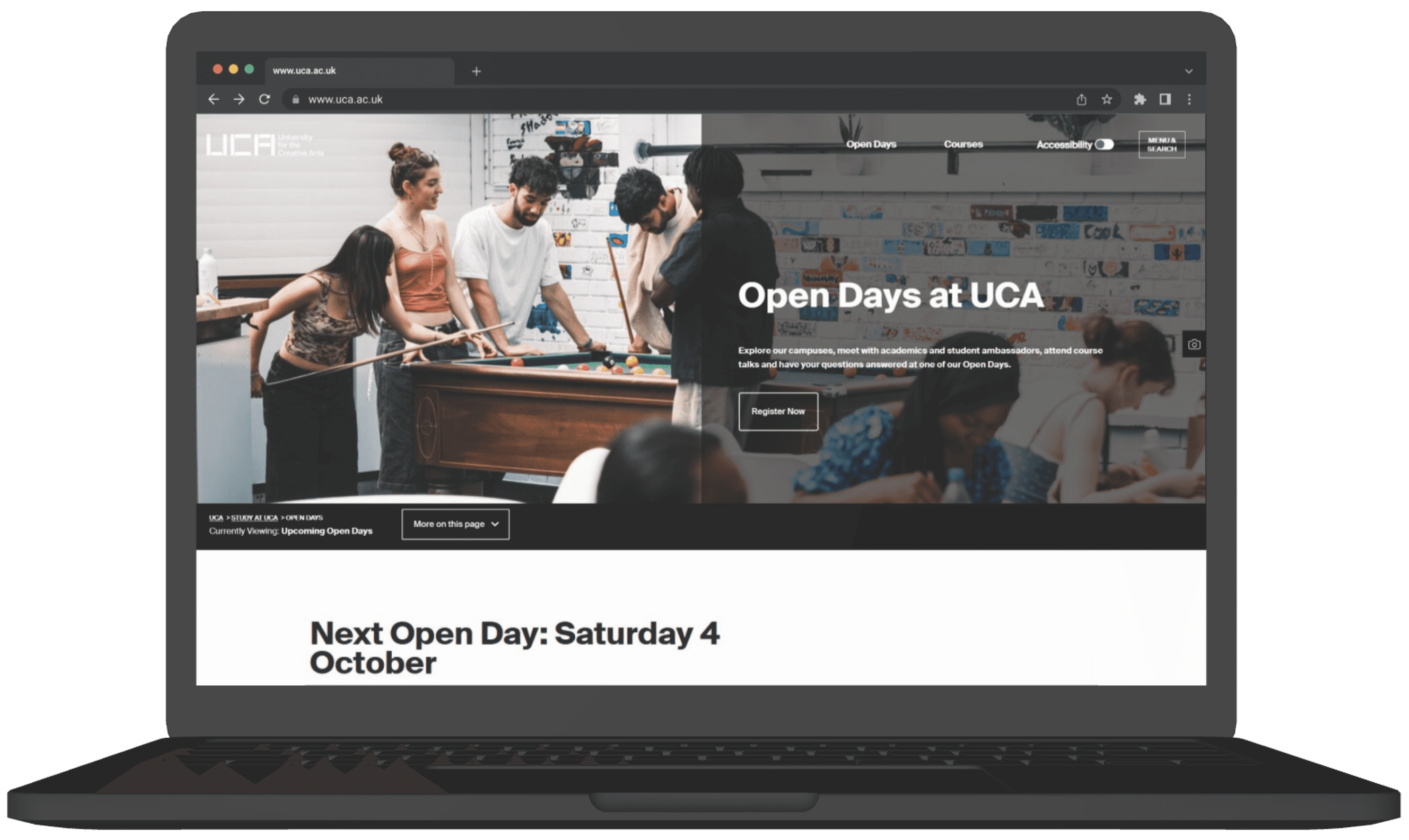
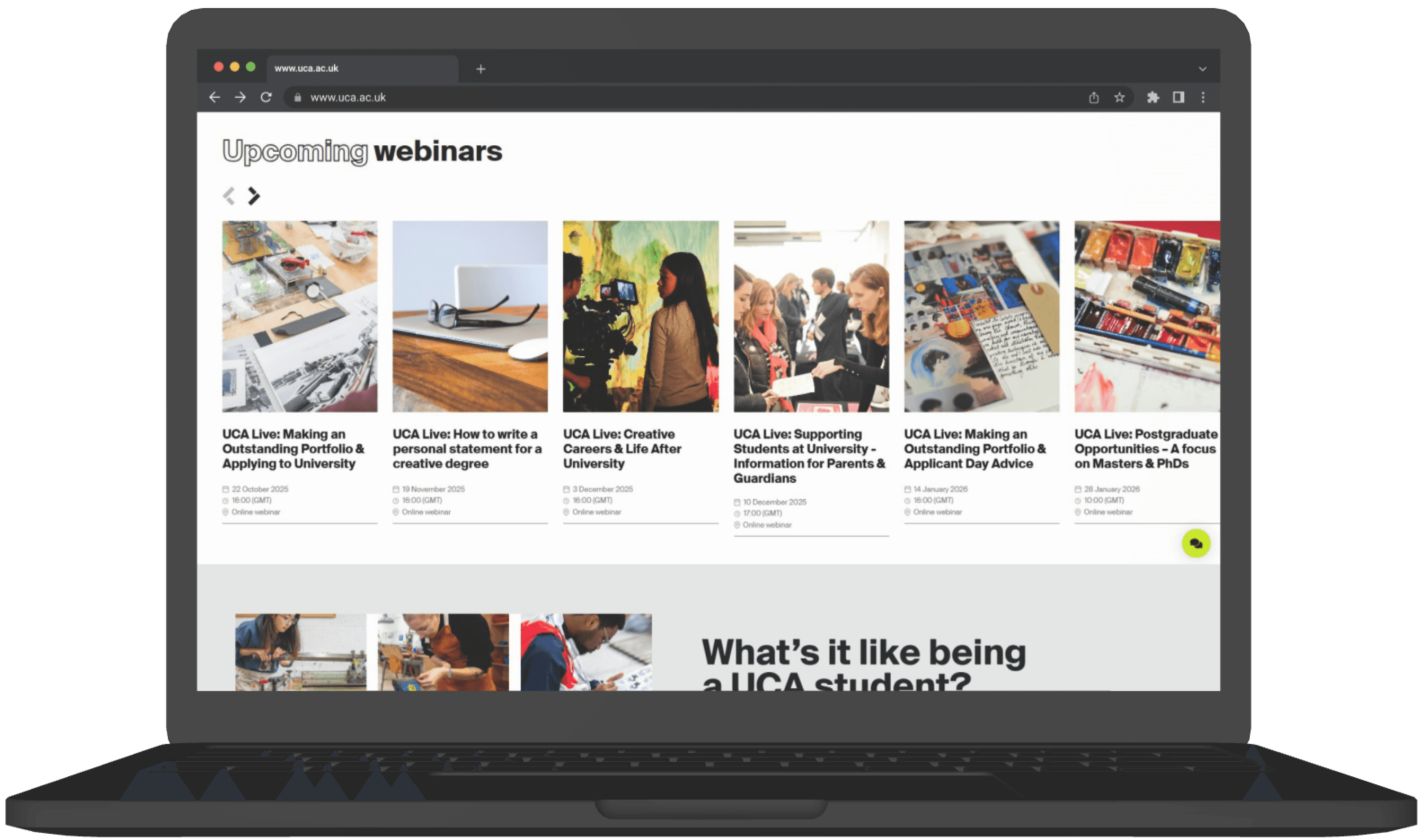
UCA's first grid-based Open Day microsite, built for the students it was meant to attract.
Then three impact lines, no bullets:
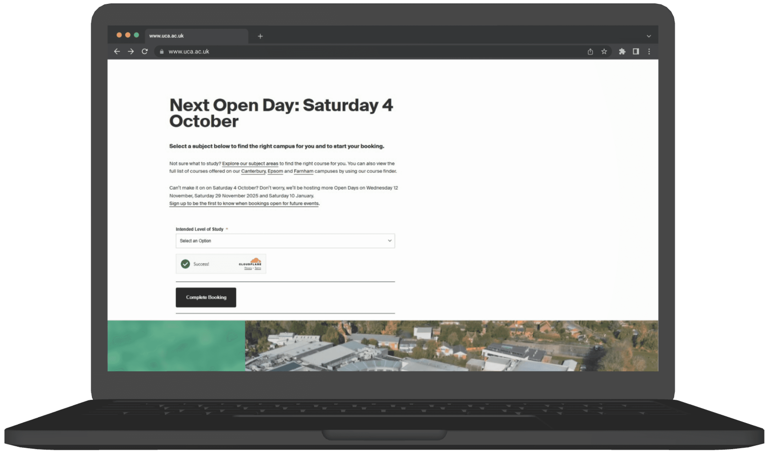
Booking flow reduced from 7 steps to 3, with a single inline card replacing multiple redirects
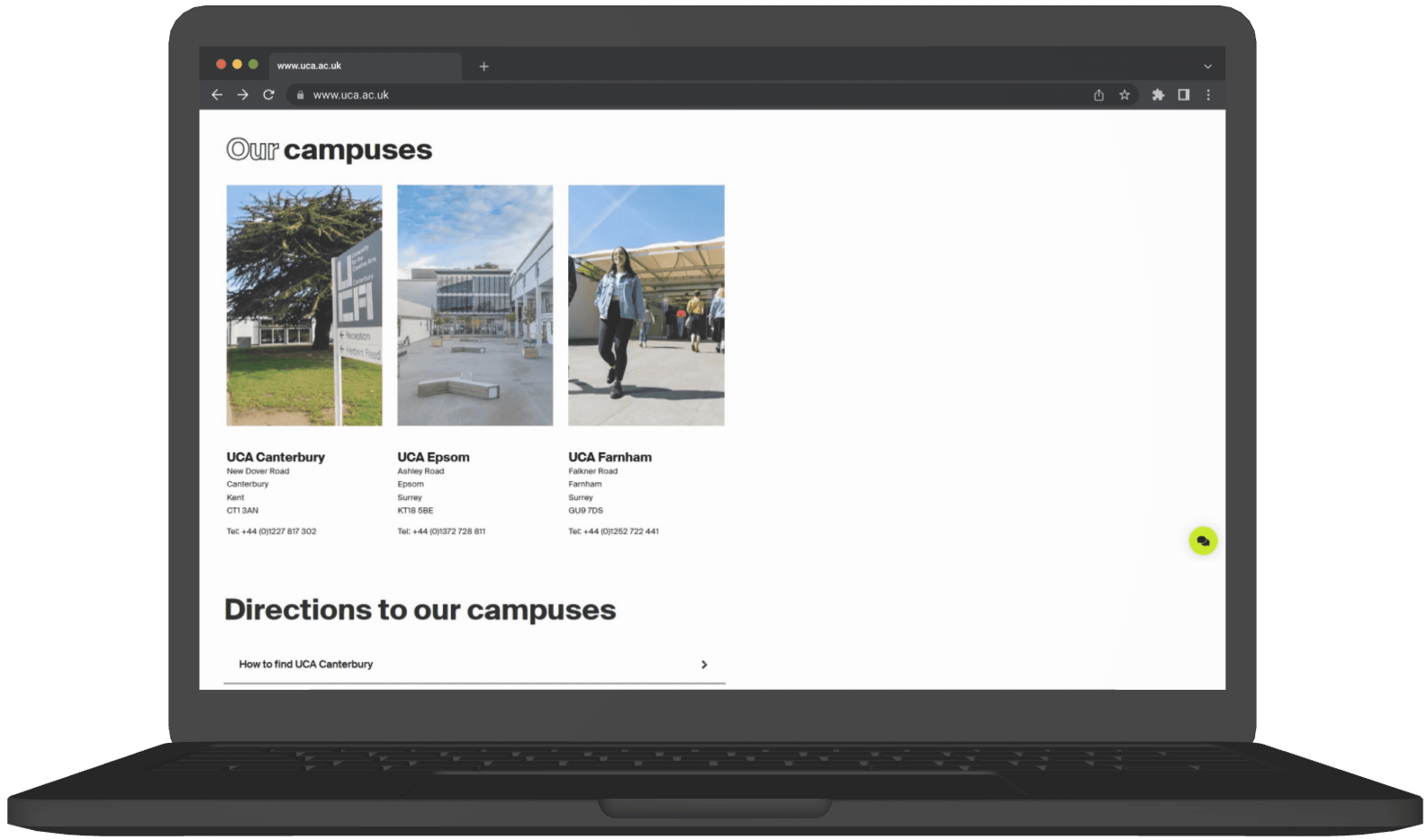
Campus locations surfaced on every page solving the navigation blindness found in every test session
A visual system that finally matches UCA's creative identity bold grid, expressive type, bright palette
Click in the frame once to start interacting, press 'R' to return to the homepage.
On design : Aesthetic polish can mask usability failures
Users in round one loved how the prototype looked and still couldn't complete the booking flow. Visual quality created false confidence in the design. The problem was structural, not surface-level.
Next time I would :
Test navigation and task flows in lo-fi before any visual design begins separate the two problems entirely.
On research : Design for two audiences, not one
I assumed the user was always the prospective student. Testing revealed the site also needed to work for anxious parents making the same decision. They needed completely different signals from the same page.
Next time I would :
Define all user groups before testing not midway through iteration when it's expensive to change.
On collaboration : Document decisions
Working across 4 designers, I learned that undocumented decisions get rebuilt from scratch. Twice I had to re-explain design choices that had already been tested and discarded costing time we didn't have.
Next time I would :
Create a shared decision log from day one what we tested, what we changed, and why.
You might also like
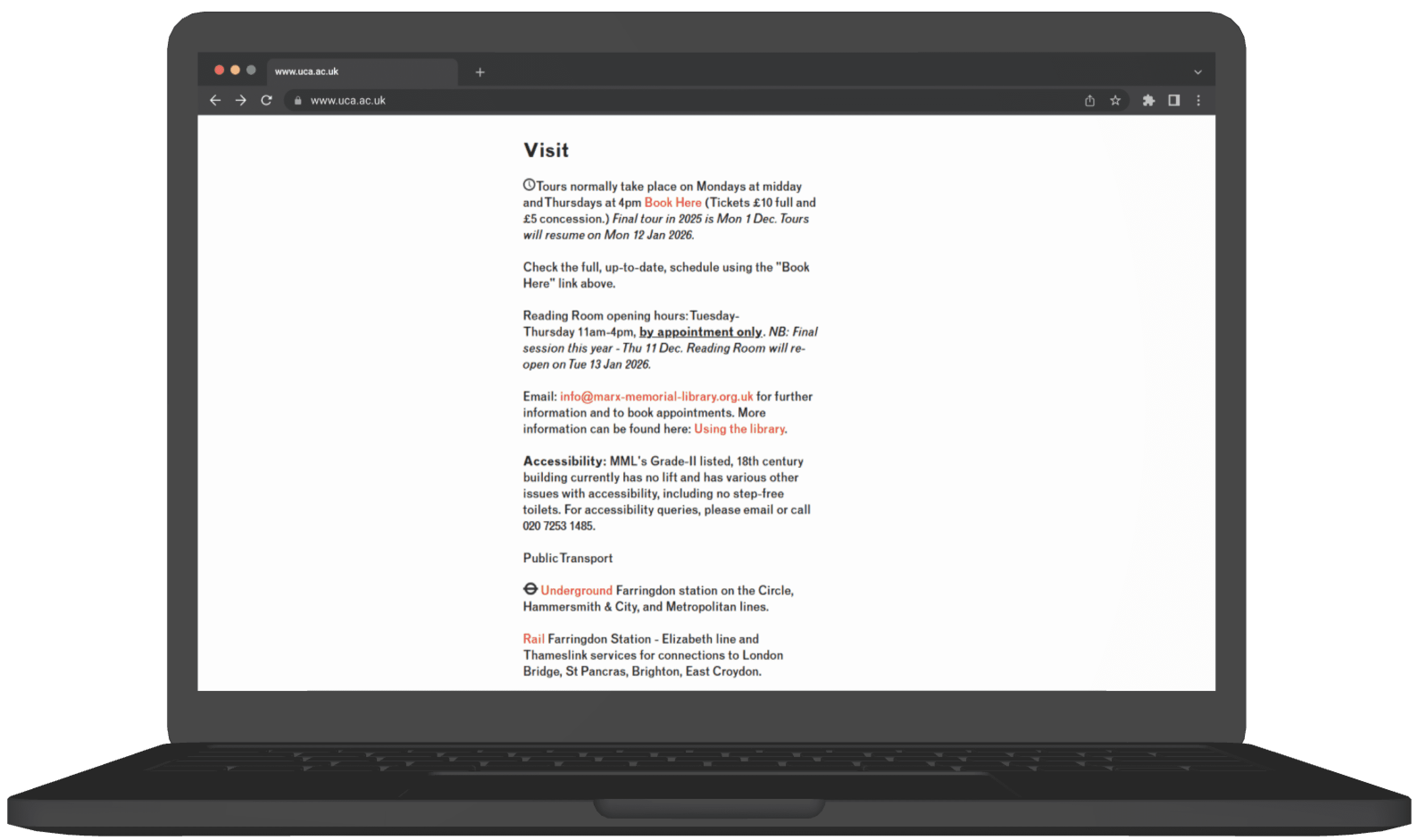
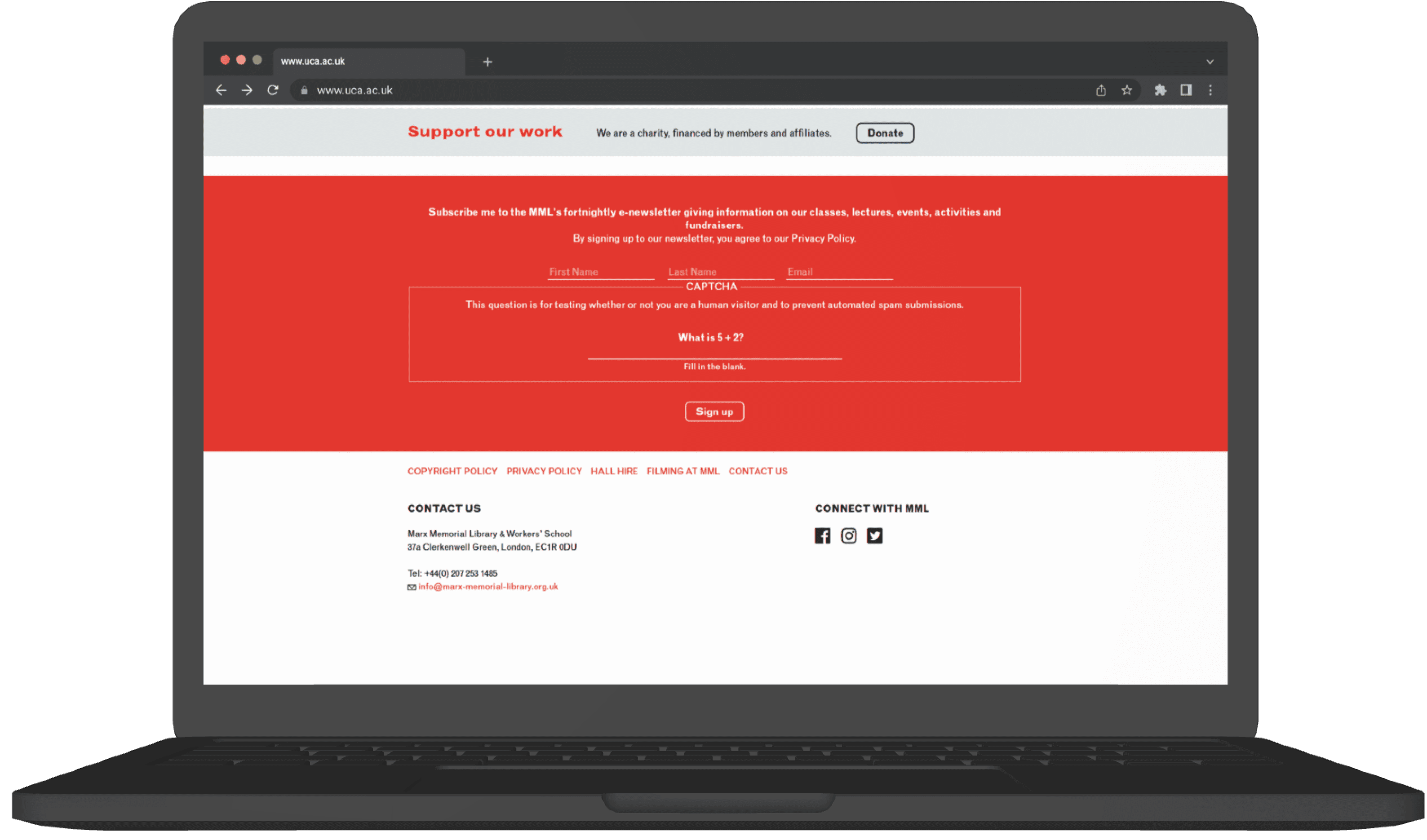
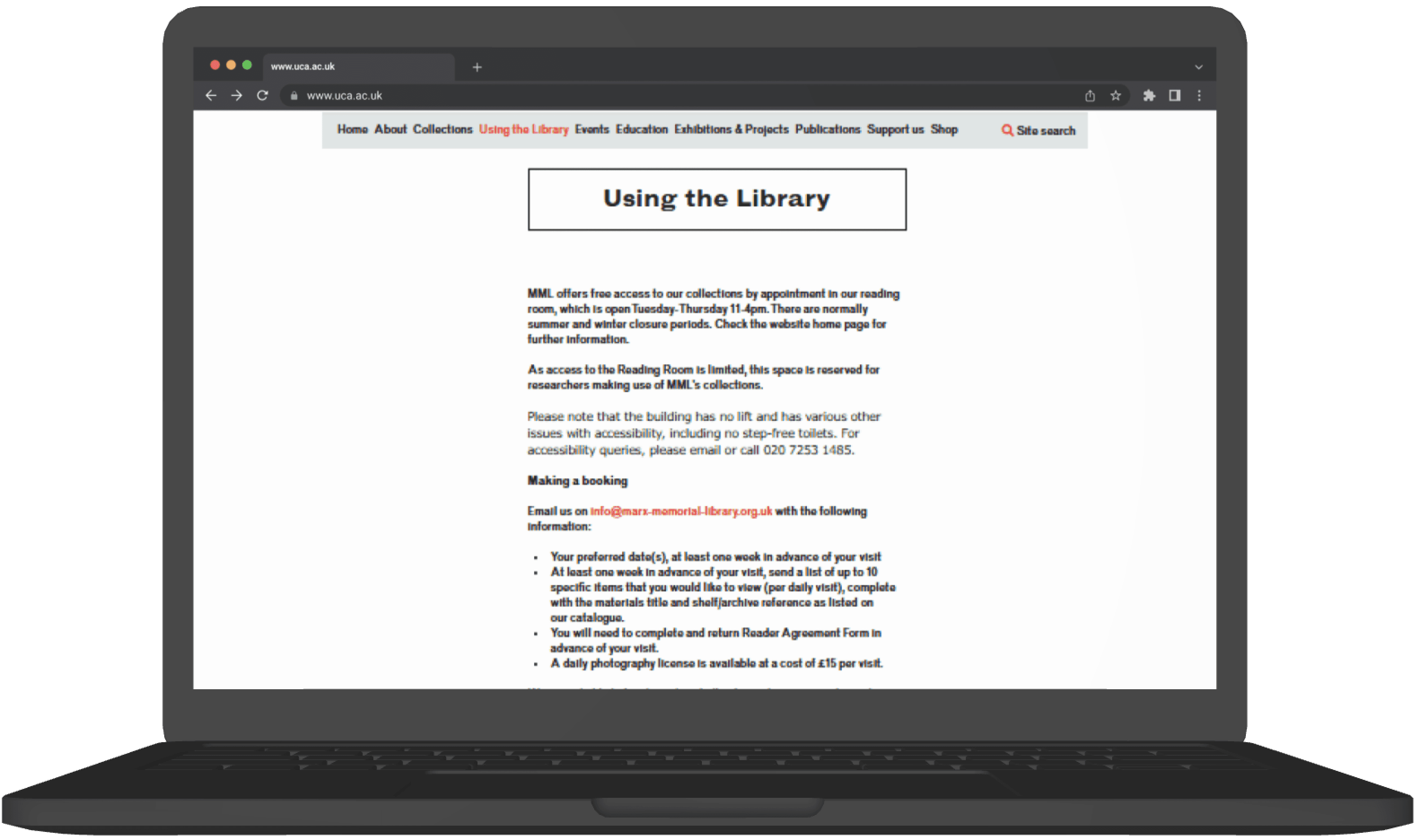
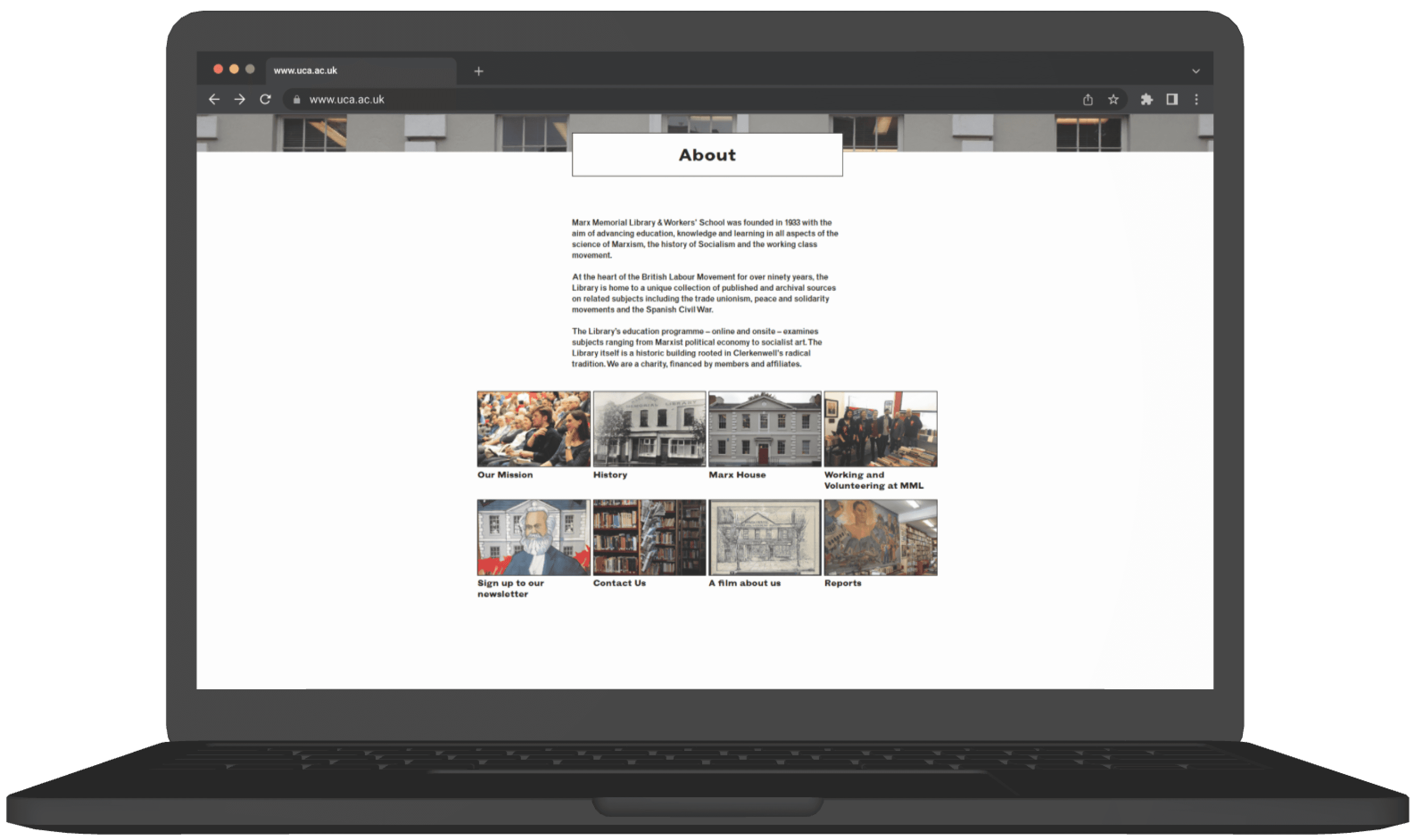
Marx Memorial Library
A real client project to solve MML’s low visibility by redesigning its branding to engage younger audiences while respecting its history.
real client
branding
visual design

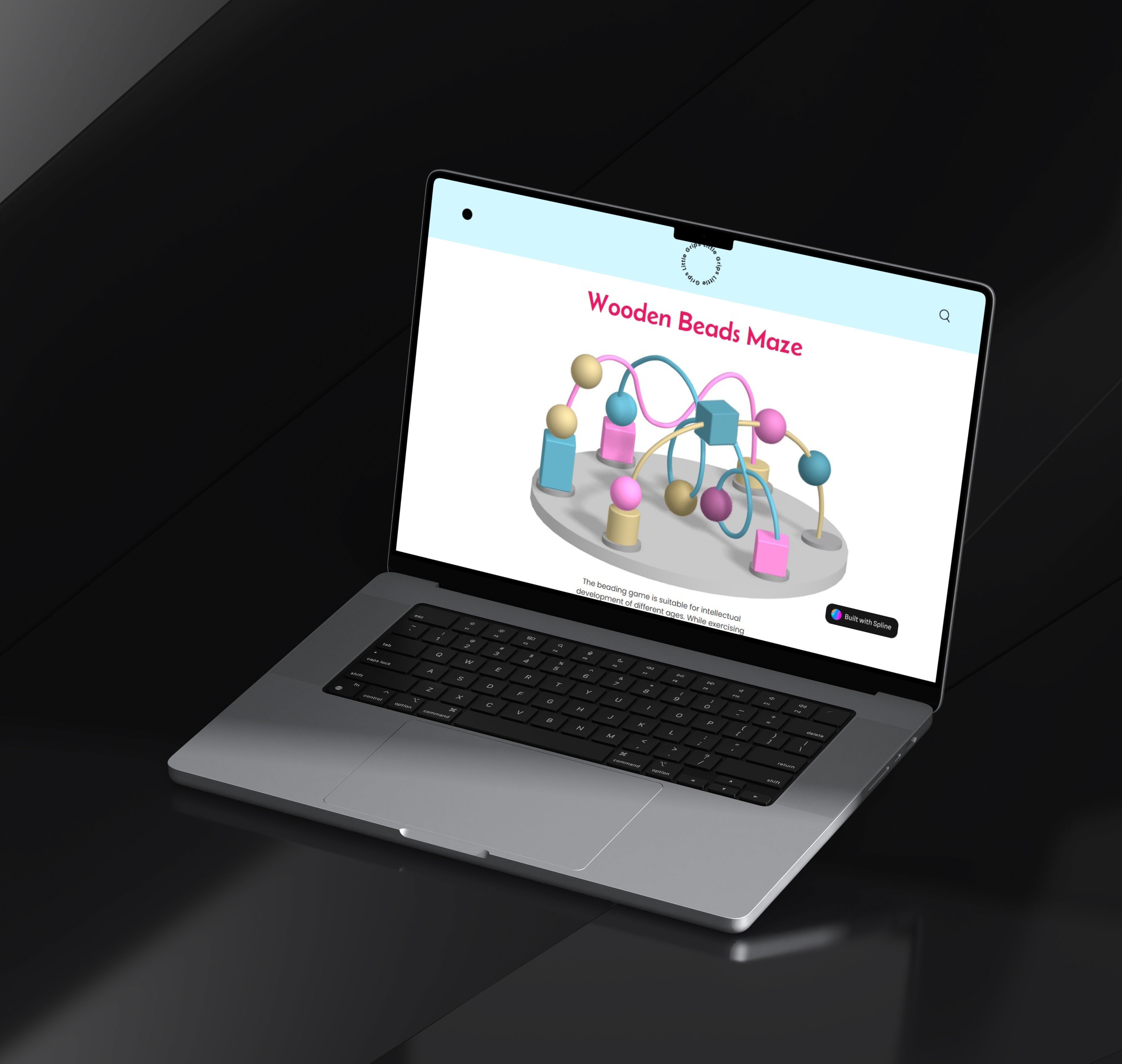
Little Grips: A Digital Play Experience
A digital reimagining of a classic toy that brings tactile play to the digital world, combined with clear visual solutions that help people understand and reduce their plastic footprint.
sustainability
visual design
system mapping