Marx Memorial Library
Marx Memorial Library
MML struggled with low visibility and an outdated digital presence. I created a refreshed brand system and redesigned its website to provide clearer navigation and a more engaging experience.
MML struggled with low visibility and an outdated digital presence. I created a refreshed brand system and redesigned its website to provide clearer navigation and a more engaging experience.
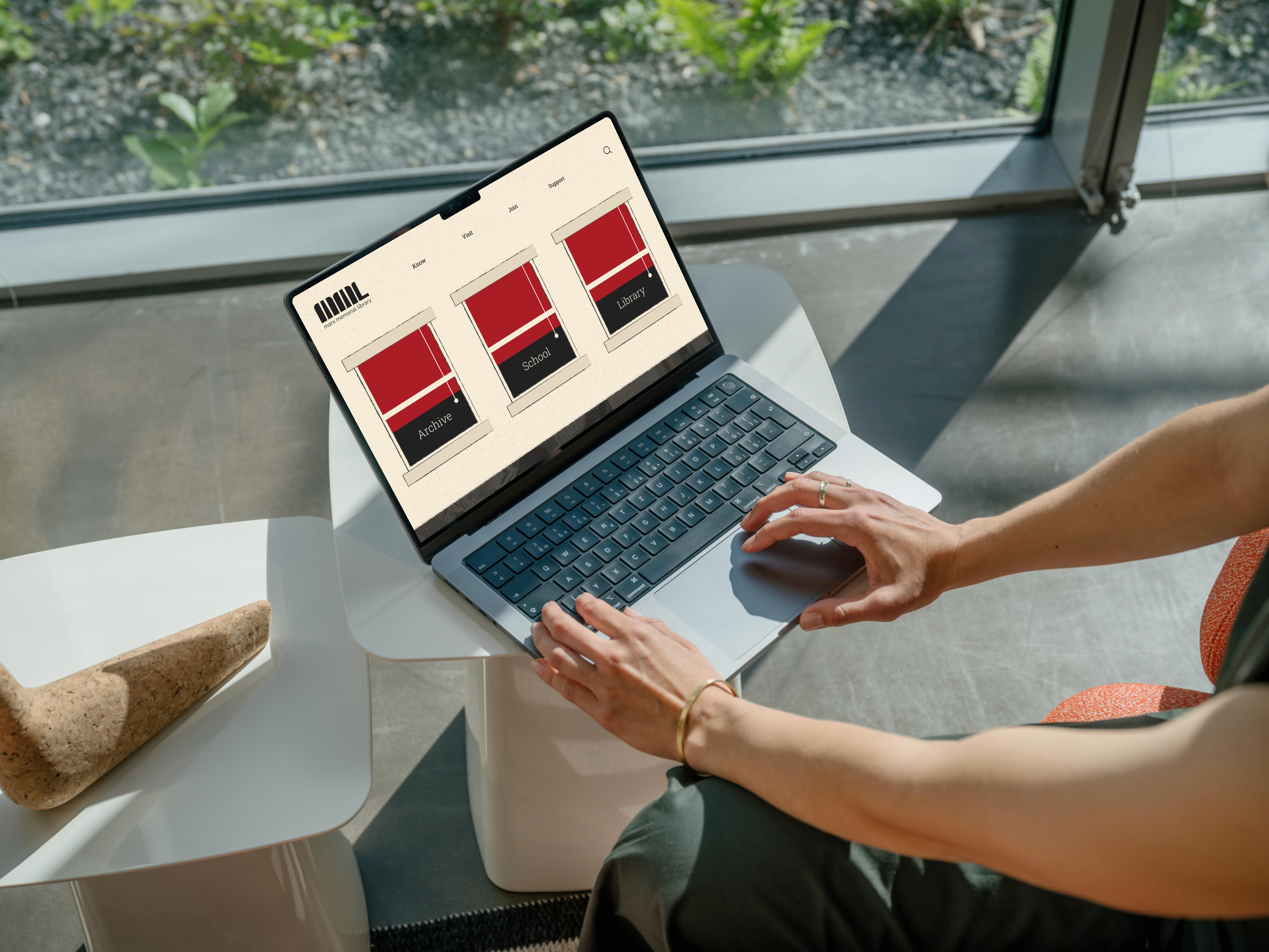
The Marx Memorial Library holds one of London's most significant collections of political and cultural history. But walk past it on the street and you'd never know. The digital experience was just as invisible outdated, hard to navigate, and disconnected from the depth of what's inside. I worked with a team of 4 to redesign the brand and website from the ground up, making the library as discoverable online as its archives deserve to be.
The Marx Memorial Library holds one of London's most significant collections of political and cultural history. But walk past it on the street and you'd never know. The digital experience was just as invisible outdated, hard to navigate, and disconnected from the depth of what's inside. I worked with a team of 4 to redesign the brand and website from the ground up, making the library as discoverable online as its archives deserve to be.
Project type:
Website Redesign
Timeline:
7 weeks (2024)
Tool:
Figma, Figjam, Adobe Illustrator
My Role:
UX Lead - IA, user flows, research
Team:
2 UX, 1 Graphic Designer
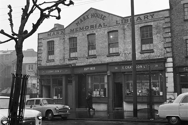
MML houses one of the UK's most important collections of political and cultural history. Its website didn't reflect that and most people never got close enough to find out.
The challenge wasn't just a redesign. It was closing the gap between a Grade II listed building that physically "fades into the streets" and the depth of what lives inside it. The navigation was dense, the branding inconsistent, and younger audiences had no clear way in all while preserving the history that makes the library worth visiting in the first place.
MML houses one of the UK's most important collections of political and cultural history. Its website didn't reflect that and most people never got close enough to find out.
The challenge wasn't just a redesign. It was closing the gap between a Grade II listed building that physically "fades into the streets" and the depth of what lives inside it. The navigation was dense, the branding inconsistent, and younger audiences had no clear way in all while preserving the history that makes the library worth visiting in the first place.
The audit confirmed what the site visit revealed the website wasn't just outdated, it was actively hiding the library's value. That became the brief for everything that followed
3x
Improved brand visibility, hierarchy and clearer navigation :
Increase in how easily visitors identify and understand MML through the new logo, color system, and consistent visual identity.
3x
Improved brand visibility, hierarchy and clearer navigation :
Increase in how easily visitors identify and understand MML through the new logo, color system, and consistent visual identity.
60%
Reduced effort required to access key informationt :
Streamlined layouts and clearer hierarchy cut information-finding time.
60%
Reduced effort required to access key informationt :
Streamlined layouts and clearer hierarchy cut information-finding time.
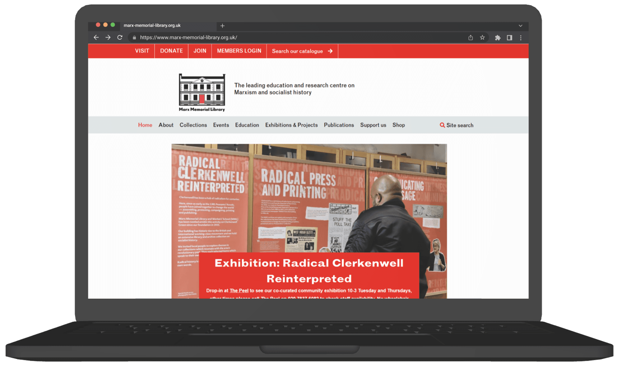
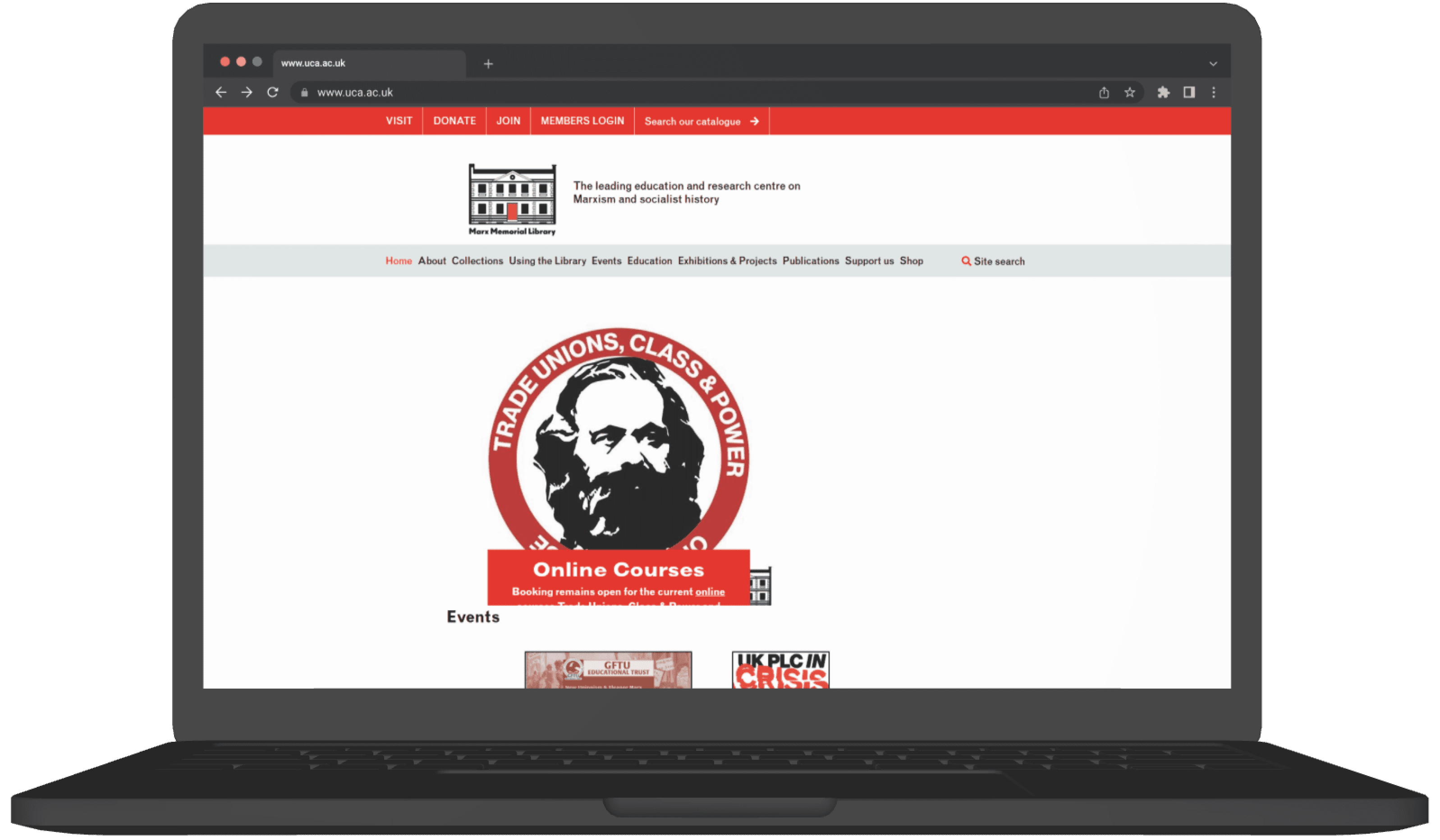
The current website homepage
The current website homepage

Site Visit & Interviews

Before we even stepped inside the Marx Memorial Library, I spent time researching its history so we knew exactly what questions to ask. When we visited, I sat down with the people who run it and the people who use it to understand how the library actually works and what was holding it back. We realized a big problem: the library is full of incredible stories, but it "fades into the streets" because there’s no clear signage and it is almost "silent" online. Our mission became clear, we needed to take this "hidden" archive and turn it into a "house of knowledge" that is easy to find, fun to use, and feels like home.
Findings
Key themes emerging from user interviews around archives, visibility, and engagement.
UX Audit





Overcrowded Header
Multiple stacked navigation bars make it hard to know where to start.Weak Visual Hierarchy
No clear headline; users don’t know the main purpose of the page at first glance.Too Much Empty Space
Large white gaps push important content downwardMisaligned Branding
The hero graphic style doesn’t match the logo or overall visual identity, causing inconsistency.No Clear Call-to-Action
The hero section doesn’t guide users toward actions like “Explore Archives” or “Visit Us.”Low Engagement Visuals
The hero image appears without context and doesn’t communicate what the library offers.Navigation Feels Disconnected
Top links (Visit, Donate, Join) feel isolated from the main menu, creating confusion.?
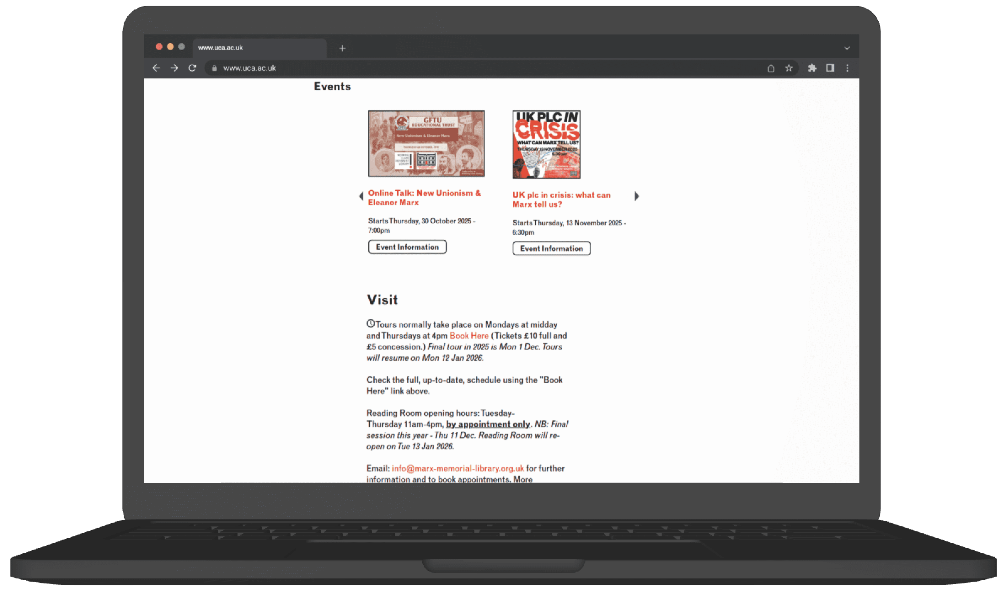

Low Visual Engagement
Event cards look small and visually disconnected from each other; no clear grouping or structure. Posters are too small to readUnclear Navigation Arrows
The left/right arrows appear far from the content and don’t visually signal that this is a carousel.Missing Context
No section description or preview text to explain what types of events MML offers.Overwhelming Text Block
Long paragraphs with no visual breaksLack of Structure
No clear grouping of information (e.g., Tours, Reading Room, Contact, Accessibility) everything blends together.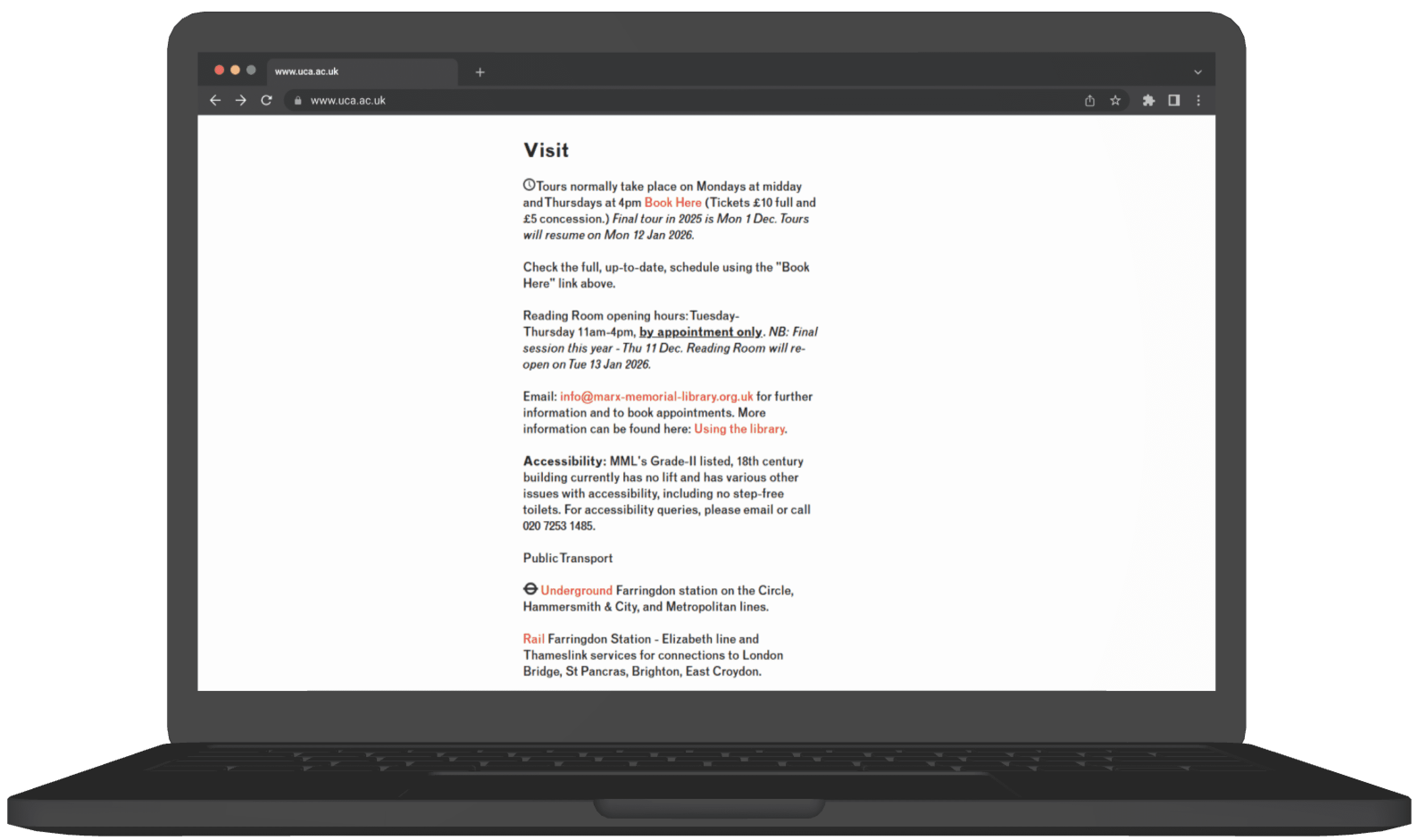


?
}
Weak Visual Hierarchy
All text looks similar in weight and spacing, so important info (hours, booking, accessibility) doesn’t stand out.Low Readability
Dense text, italics, and mixed formatting reduce clarity, especially for users skimming for practical details.Overwhelming Red Background
The heavy color block reduces readability and adds visual strain.Inefficient Use of Space
Large empty areas above and below the form make the layout feel unbalanced.Overwhelming Red Background
The heavy color block reduces readability and adds visual strain.Unclear CAPTCHA Placement
CAPTCHA text appears merged with form fields, causing confusion about the form flow.Low Visibility CTA
The “Sign up” button blends into the background and lacks prominence.No Icons or Visuals
Useful quick-scan elements like map pins, or accessibility icons are missing, making the page less user-friendly.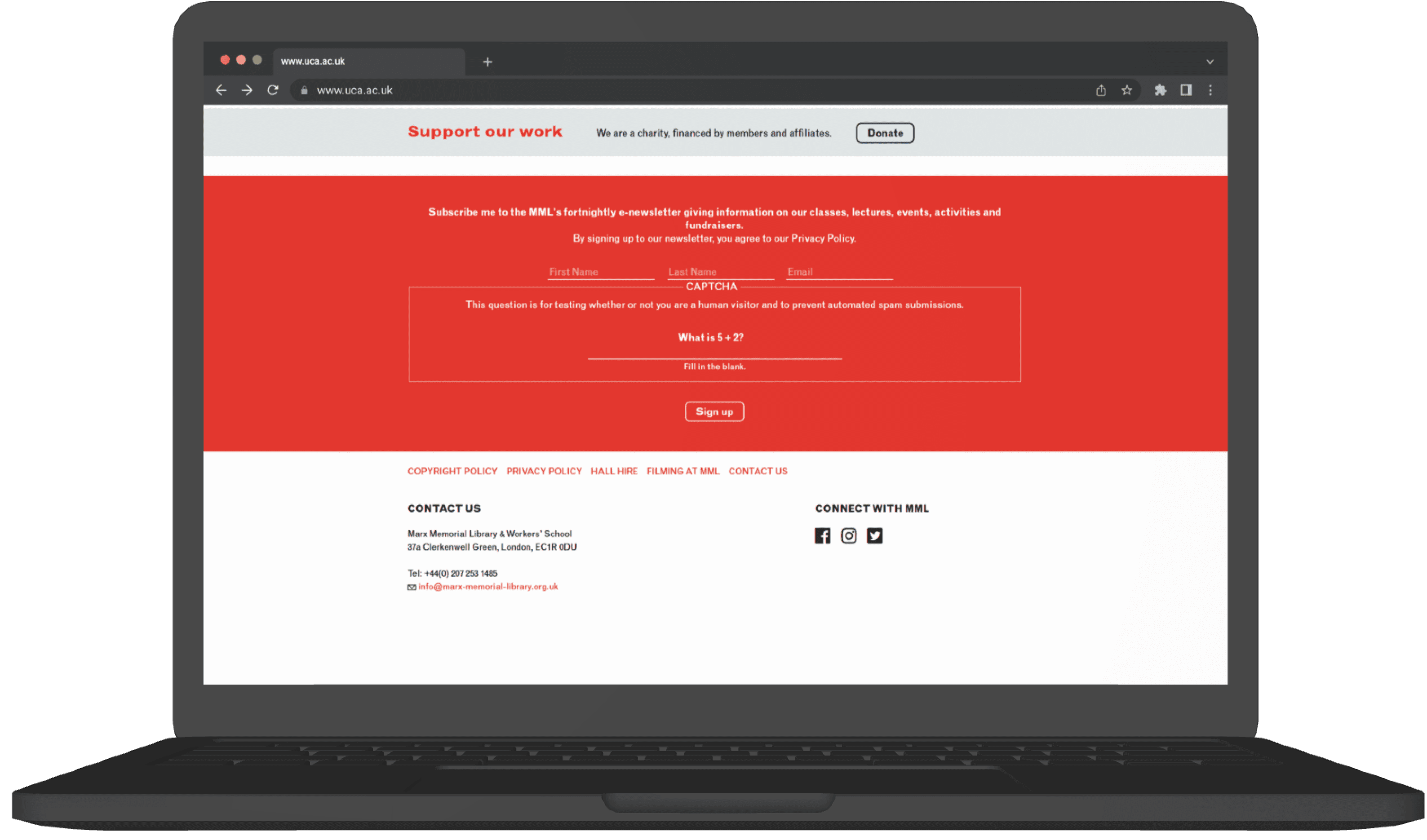




?

?


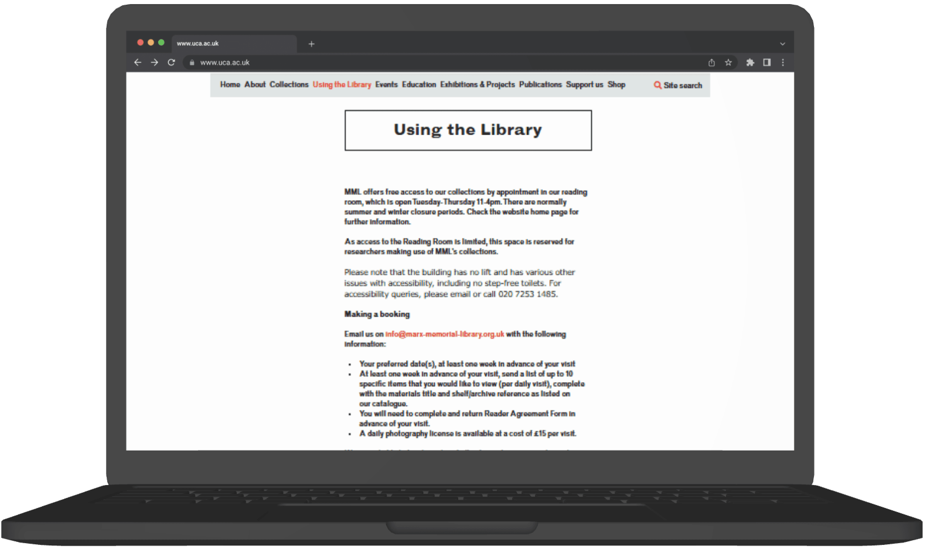
Dense, Unscannable Text
Long paragraphs without spacing or visual breaksPoor Layout Balance
Narrow column of text on the left creates a heavy imbalance, leaving empty space.Lack of Clear Grouping
Important topics (Booking, Copying, Enquiries, Workshops, Policies) are not visually separated, making navigation harder.Inconsistent Link Styling
Red text links appear scattered throughout without structureInconsistent Link Styling
Red text links appear scattered throughout without structure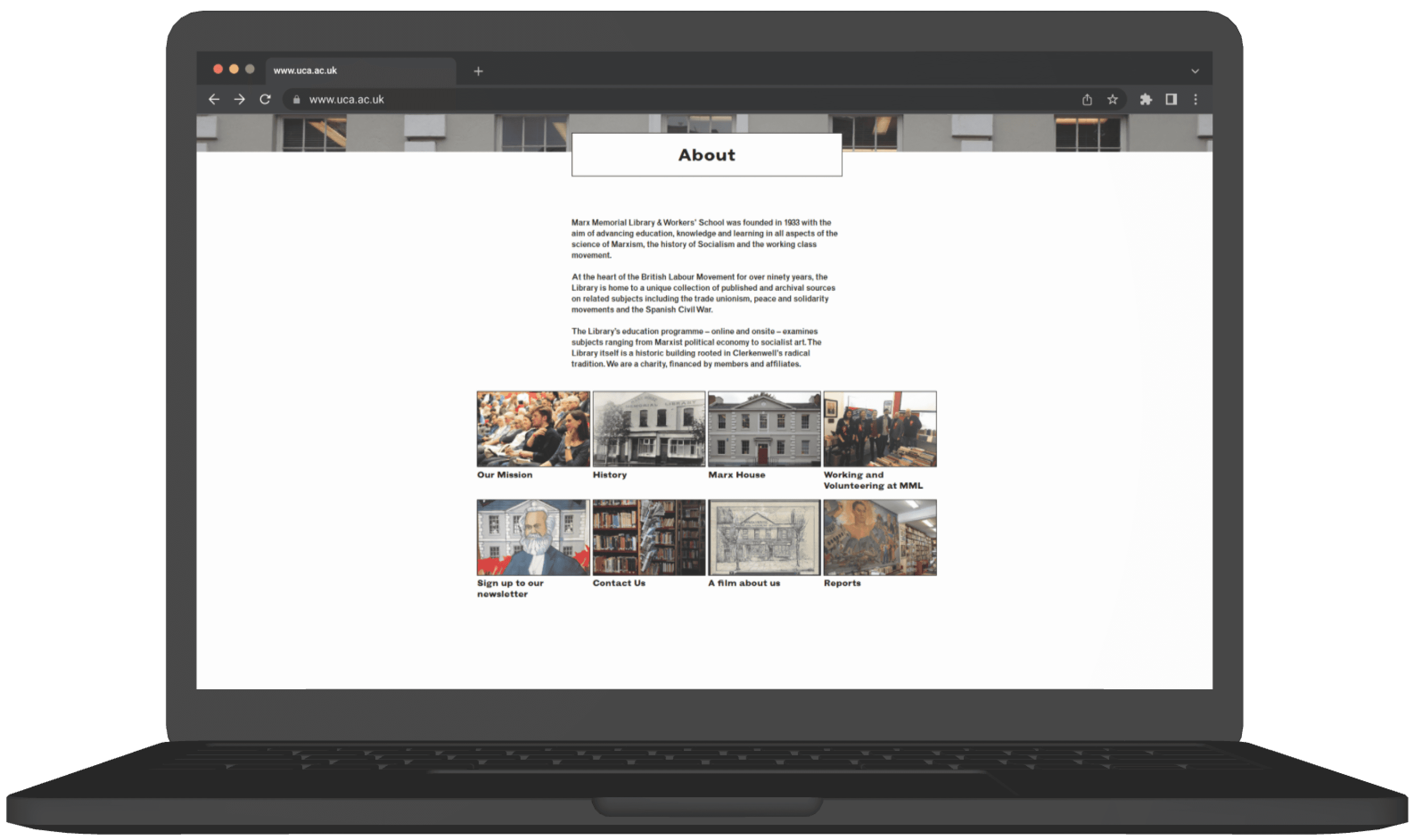
?
?

No Clear Content Structure
Missing Calls to Action
Accessibility Concerns
?
Weak Visual Hierarchy
Overwhelming Text Block
Unbalanced Layout
Inconsistent Alignment
Overcrowded Header
Multiple stacked navigation bars make it hard to know where to start.Weak Visual Hierarchy
No clear headline; users don’t know the main purpose of the page at first glance.Too Much Empty Space
Large white gaps push important content downwardMisaligned Branding
The hero graphic style doesn’t match the logo or overall visual identity, causing inconsistency.No Clear Call-to-Action
The hero section doesn’t guide users toward actions like “Explore Archives” or “Visit Us.”Low Engagement Visuals
The hero image appears without context and doesn’t communicate what the library offers.Navigation Feels Disconnected
Top links (Visit, Donate, Join) feel isolated from the main menu, creating confusion.?
Low Visual Engagement
Event cards look small and visually disconnected from each other; no clear grouping or structure. Posters are too small to readUnclear Navigation Arrows
The left/right arrows appear far from the content and don’t visually signal that this is a carousel.Missing Context
No section description or preview text to explain what types of events MML offers.Overwhelming Text Block
Long paragraphs with no visual breaksLack of Structure
No clear grouping of information (e.g., Tours, Reading Room, Contact, Accessibility) everything blends together.?
}
Weak Visual Hierarchy
All text looks similar in weight and spacing, so important info (hours, booking, accessibility) doesn’t stand out.Low Readability
Dense text, italics, and mixed formatting reduce clarity, especially for users skimming for practical details.Overwhelming Red Background
The heavy color block reduces readability and adds visual strain.Inefficient Use of Space
Large empty areas above and below the form make the layout feel unbalanced.Overwhelming Red Background
The heavy color block reduces readability and adds visual strain.Unclear CAPTCHA Placement
CAPTCHA text appears merged with form fields, causing confusion about the form flow.Low Visibility CTA
The “Sign up” button blends into the background and lacks prominence.No Icons or Visuals
Useful quick-scan elements like map pins, or accessibility icons are missing, making the page less user-friendly.?
?
Dense, Unscannable Text
Long paragraphs without spacing or visual breaksPoor Layout Balance
Narrow column of text on the left creates a heavy imbalance, leaving empty space.Lack of Clear Grouping
Important topics (Booking, Copying, Enquiries, Workshops, Policies) are not visually separated, making navigation harder.Inconsistent Link Styling
Red text links appear scattered throughout without structureInconsistent Link Styling
Red text links appear scattered throughout without structure?
?
No Clear Content Structure
Missing Calls to Action
Accessibility Concerns
?
Weak Visual Hierarchy
Overwhelming Text Block
Unbalanced Layout
Inconsistent Alignment
Overcrowded Header
Multiple stacked navigation bars make it hard to know where to start.Weak Visual Hierarchy
No clear headline; users don’t know the main purpose of the page at first glance.Too Much Empty Space
Large white gaps push important content downwardMisaligned Branding
The hero graphic style doesn’t match the logo or overall visual identity, causing inconsistency.No Clear Call-to-Action
The hero section doesn’t guide users toward actions like “Explore Archives” or “Visit Us.”Low Engagement Visuals
The hero image appears without context and doesn’t communicate what the library offers.Navigation Feels Disconnected
Top links (Visit, Donate, Join) feel isolated from the main menu, creating confusion.?
Low Visual Engagement
Event cards look small and visually disconnected from each other; no clear grouping or structure. Posters are too small to readUnclear Navigation Arrows
The left/right arrows appear far from the content and don’t visually signal that this is a carousel.Missing Context
No section description or preview text to explain what types of events MML offers.Overwhelming Text Block
Long paragraphs with no visual breaksLack of Structure
No clear grouping of information (e.g., Tours, Reading Room, Contact, Accessibility) everything blends together.?
}
Weak Visual Hierarchy
All text looks similar in weight and spacing, so important info (hours, booking, accessibility) doesn’t stand out.Low Readability
Dense text, italics, and mixed formatting reduce clarity, especially for users skimming for practical details.Overwhelming Red Background
The heavy color block reduces readability and adds visual strain.Inefficient Use of Space
Large empty areas above and below the form make the layout feel unbalanced.Overwhelming Red Background
The heavy color block reduces readability and adds visual strain.Unclear CAPTCHA Placement
CAPTCHA text appears merged with form fields, causing confusion about the form flow.Low Visibility CTA
The “Sign up” button blends into the background and lacks prominence.No Icons or Visuals
Useful quick-scan elements like map pins, or accessibility icons are missing, making the page less user-friendly.?
?
Dense, Unscannable Text
Long paragraphs without spacing or visual breaksPoor Layout Balance
Narrow column of text on the left creates a heavy imbalance, leaving empty space.Lack of Clear Grouping
Important topics (Booking, Copying, Enquiries, Workshops, Policies) are not visually separated, making navigation harder.Inconsistent Link Styling
Red text links appear scattered throughout without structureInconsistent Link Styling
Red text links appear scattered throughout without structure?
?
No Clear Content Structure
Missing Calls to Action
Accessibility Concerns
?
Weak Visual Hierarchy
Overwhelming Text Block
Unbalanced Layout
Inconsistent Alignment
Overcrowded Header
Multiple stacked navigation bars make it hard to know where to start.Weak Visual Hierarchy
No clear headline; users don’t know the main purpose of the page at first glance.Too Much Empty Space
Large white gaps push important content downwardMisaligned Branding
The hero graphic style doesn’t match the logo or overall visual identity, causing inconsistency.No Clear Call-to-Action
The hero section doesn’t guide users toward actions like “Explore Archives” or “Visit Us.”Low Engagement Visuals
The hero image appears without context and doesn’t communicate what the library offers.Navigation Feels Disconnected
Top links (Visit, Donate, Join) feel isolated from the main menu, creating confusion.?
Low Visual Engagement
Event cards look small and visually disconnected from each other; no clear grouping or structure. Posters are too small to readUnclear Navigation Arrows
The left/right arrows appear far from the content and don’t visually signal that this is a carousel.Missing Context
No section description or preview text to explain what types of events MML offers.Overwhelming Text Block
Long paragraphs with no visual breaksLack of Structure
No clear grouping of information (e.g., Tours, Reading Room, Contact, Accessibility) everything blends together.?
}
Weak Visual Hierarchy
All text looks similar in weight and spacing, so important info (hours, booking, accessibility) doesn’t stand out.Low Readability
Dense text, italics, and mixed formatting reduce clarity, especially for users skimming for practical details.Overwhelming Red Background
The heavy color block reduces readability and adds visual strain.Inefficient Use of Space
Large empty areas above and below the form make the layout feel unbalanced.Overwhelming Red Background
The heavy color block reduces readability and adds visual strain.Unclear CAPTCHA Placement
CAPTCHA text appears merged with form fields, causing confusion about the form flow.Low Visibility CTA
The “Sign up” button blends into the background and lacks prominence.No Icons or Visuals
Useful quick-scan elements like map pins, or accessibility icons are missing, making the page less user-friendly.?
?
Dense, Unscannable Text
Long paragraphs without spacing or visual breaksPoor Layout Balance
Narrow column of text on the left creates a heavy imbalance, leaving empty space.Lack of Clear Grouping
Important topics (Booking, Copying, Enquiries, Workshops, Policies) are not visually separated, making navigation harder.Inconsistent Link Styling
Red text links appear scattered throughout without structureInconsistent Link Styling
Red text links appear scattered throughout without structure?
?
No Clear Content Structure
Missing Calls to Action
Accessibility Concerns
?
Weak Visual Hierarchy
Overwhelming Text Block
Unbalanced Layout
Inconsistent Alignment
The audit confirmed what the site visit revealed the website wasn't just outdated, it was actively hiding the library's value. That became the brief for everything that followed
Comparative Analysis
To identify industry standards for accessibility and engagement, we audited two direct competitors that manage historical data:
The London Archives: A primary competitor in archiving city history.
The British Museum: A global standard for museum accessibility and exhibition display.
Marx Memorial Library (MML): The subject of our audit (Baseline).

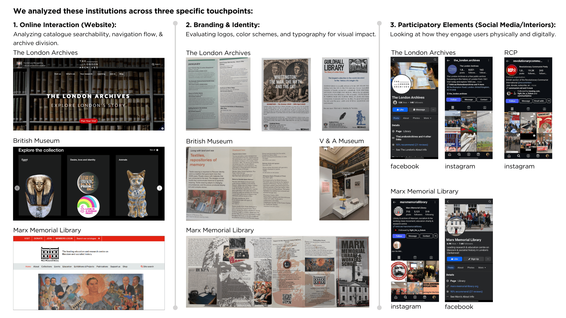
Competitors surface their archives through filters and clear taxonomy. MML buries them.
Competitors have active social channels that bring younger audiences in. MML has none.
Competitors have a flexible visual identity that travels. MML has flat red and nothing else.
"These gaps became our three design priorities"
Revisiting our research and goals
We cross-referenced our concepts against the research to make sure every design decision addressed a specific gap.
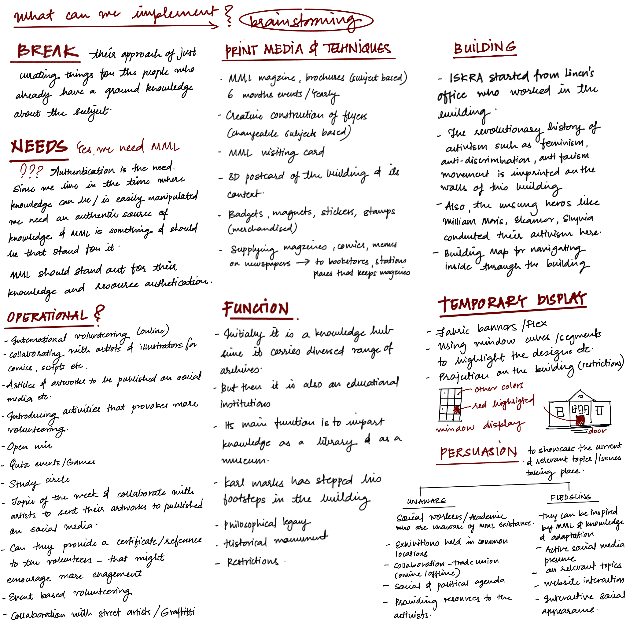
Early ideation exploring what the redesign could address across brand, digital, and physical touchpoints. →
Logo Concept Research
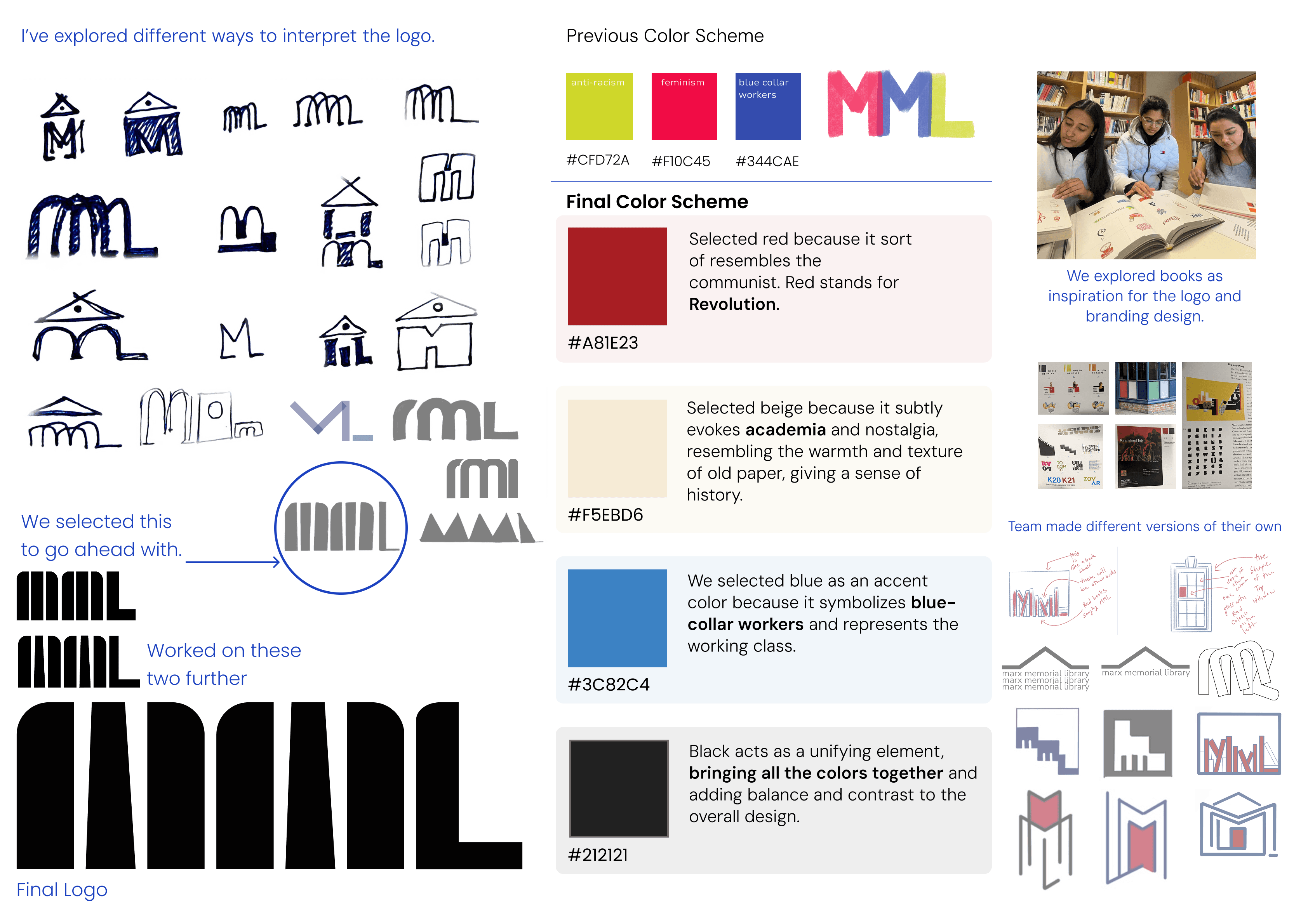
Every visual decision was guided by a single strategic tension: the library is serious, but it shouldn't feel cold. Historic, but not stuck in the past.
We built the entire identity around binary opposites : academic vs. quirky, stagnant vs. dynamic, pessimistic vs. optimistic. Each choice, from typeface to colour, was a deliberate balance between the two.
We didn't pick a font and call it a logo. We researched the history of the movement and the building itself to find a symbol.
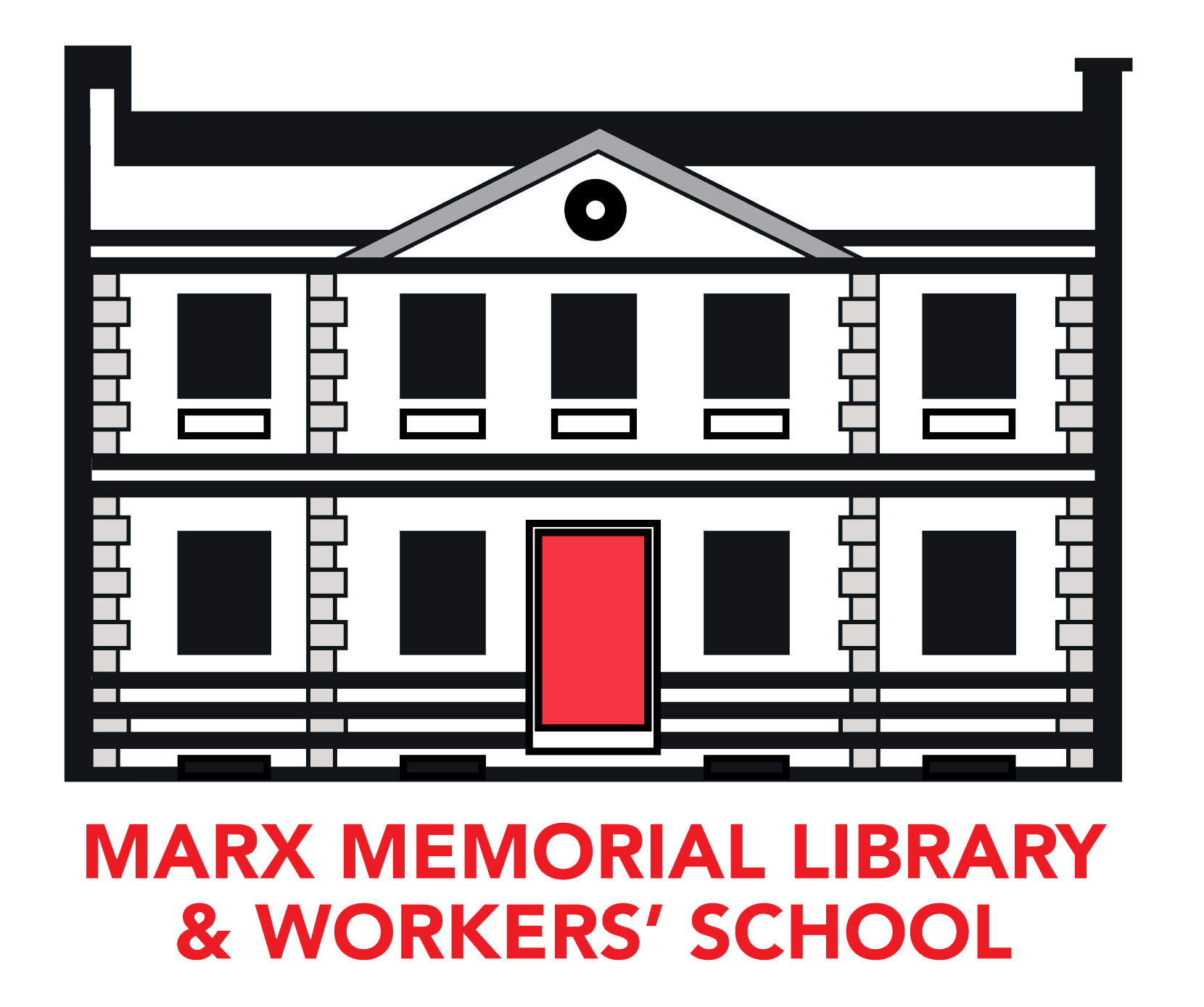
The Bookshelf Concept: We explored books as the primary inspiration for the logo. The final design aligns the letters "MML" to resemble books sitting on a shelf, symbolizing the library as a repository of knowledge.
Font Selection
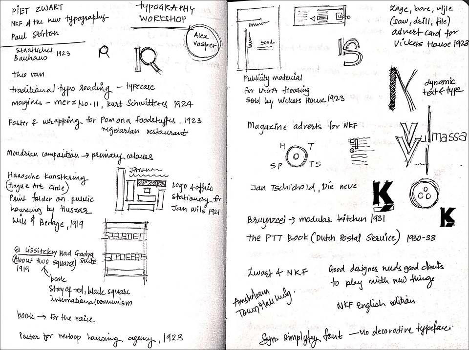
Our font selection was built on the strategy of "Binary Opposites" balancing the serious academic nature of the library with a spirited, modern accessibility.
Typography: Guided by a workshop on Piet Zwart (New Typography), we selected a contrasting pair:
Primary (Headings):
Roboto Slab – chosen to look "Academic and Serious".
Secondary (Body):
Nunito Sans – chosen to be "Flowy and Free".
Lo-Fi Designs

Early wireframes exploring layout, navigation structure, and content hierarchy across key pages. →
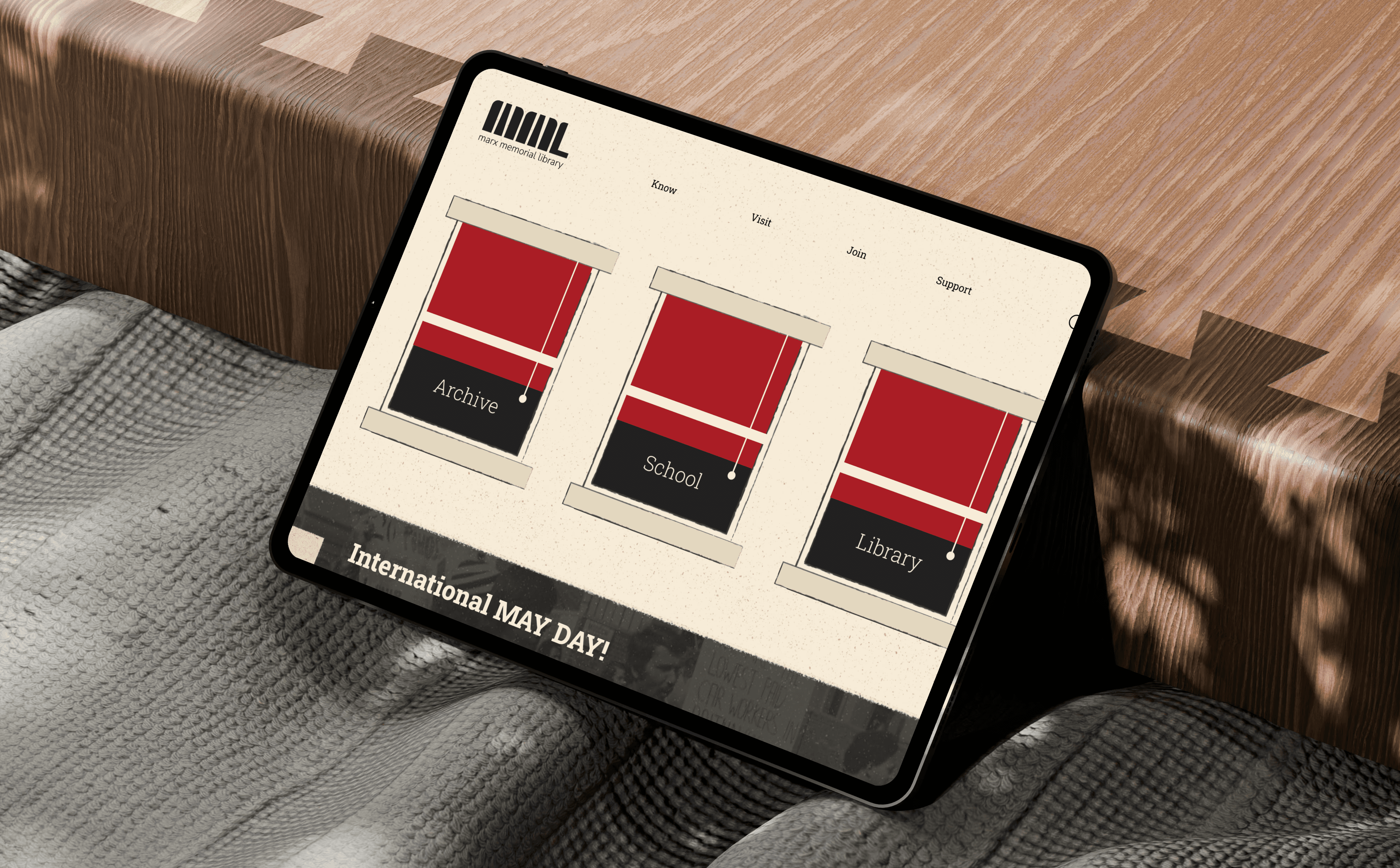
A. The building becomes the interface
Concept: The homepage features three windows that animate inward on hover, offering a glimpse into the library's interior.
Why: The digital experience starts where the physical one begins.
A. The building becomes the interface
Concept: The homepage features three windows that animate inward on hover, offering a glimpse into the library's interior.
Why: The digital experience starts where the physical one begins.
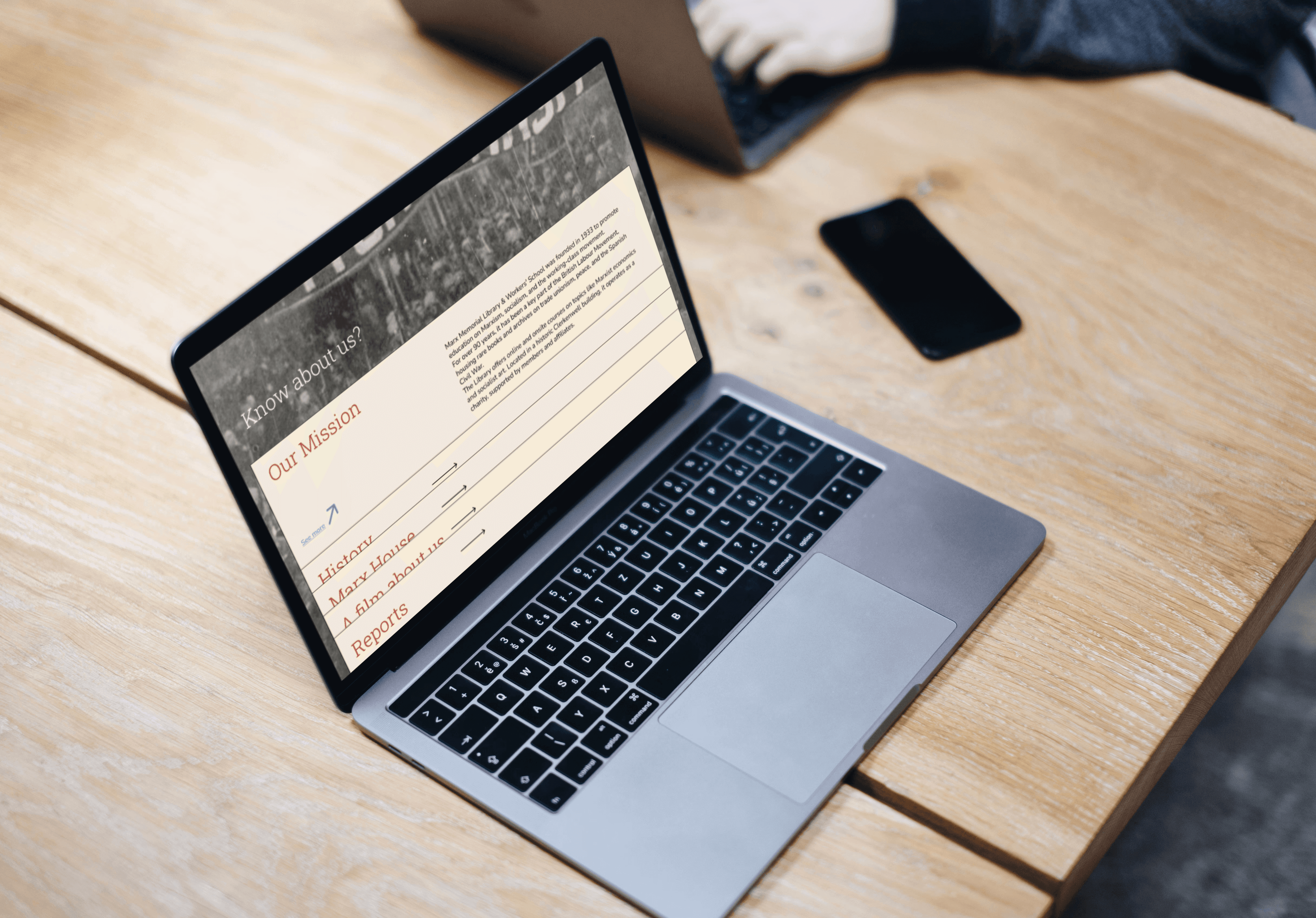
B. Archives have texture : navigation should too
Concept: The About Us page mimics a physical folder. Hovering lifts the tab, like opening an archive file.
Why: A small interaction that carries the library's identity throughout. It captures the "warmth and essence" of the library by referencing tactile objects.
B. Archives have texture : navigation should too
Concept: The About Us page mimics a physical folder. Hovering lifts the tab, like opening an archive file.
Why: A small interaction that carries the library's identity throughout. It captures the "warmth and essence" of the library by referencing tactile objects.
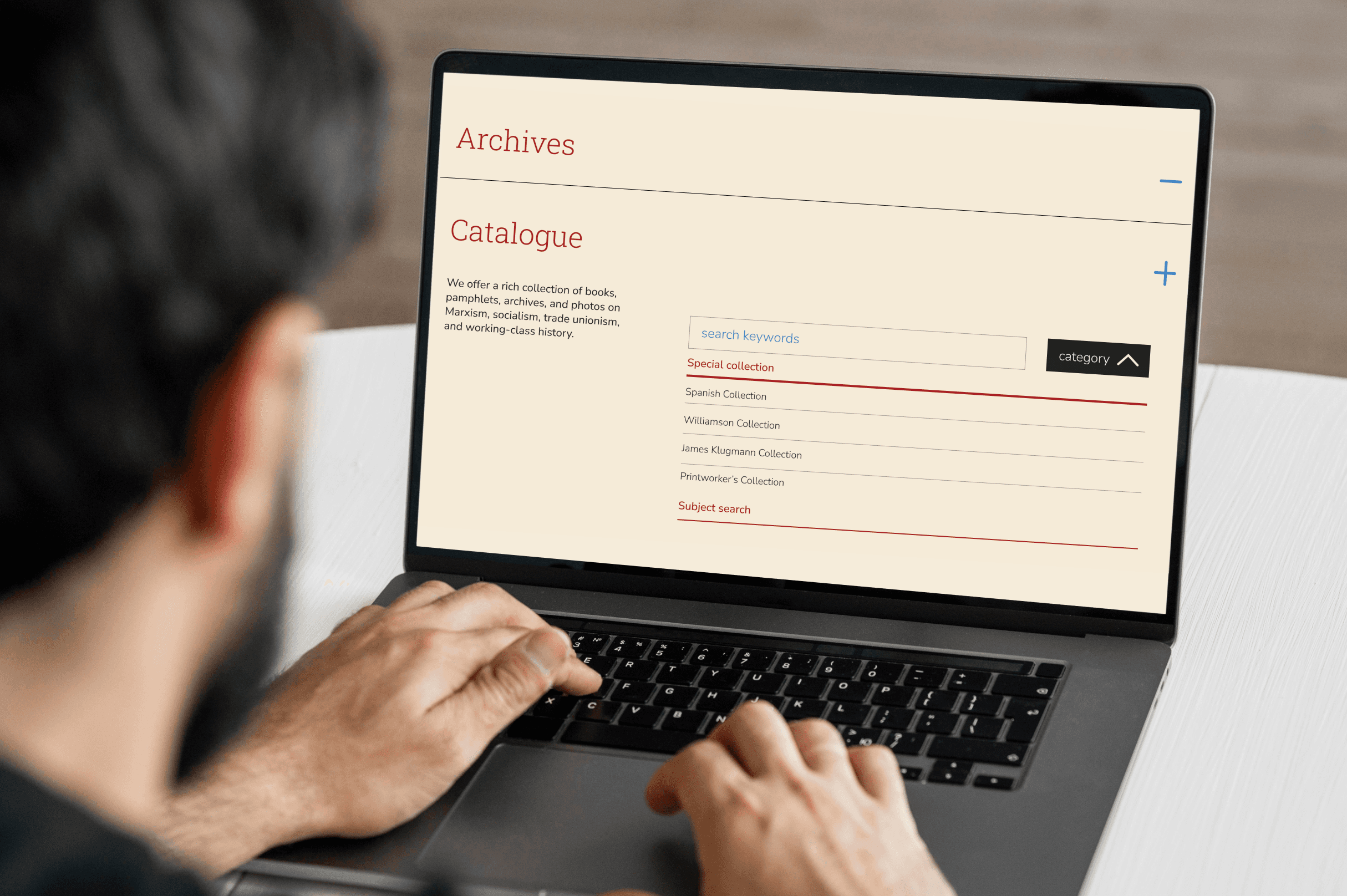
C. From five clicks to one
Problem: The old catalogue had "too many clicks" and "poorly organized content".
Solution: The old catalogue buried Special Collections behind multiple layers. I flattened the hierarchy and added faceted search filter by Type, Year, Author, and Shelf Reference simultaneously.
C. From five clicks to one
Problem: The old catalogue had "too many clicks" and "poorly organized content".
Solution: The old catalogue buried Special Collections behind multiple layers. I flattened the hierarchy and added faceted search filter by Type, Year, Author, and Shelf Reference simultaneously.
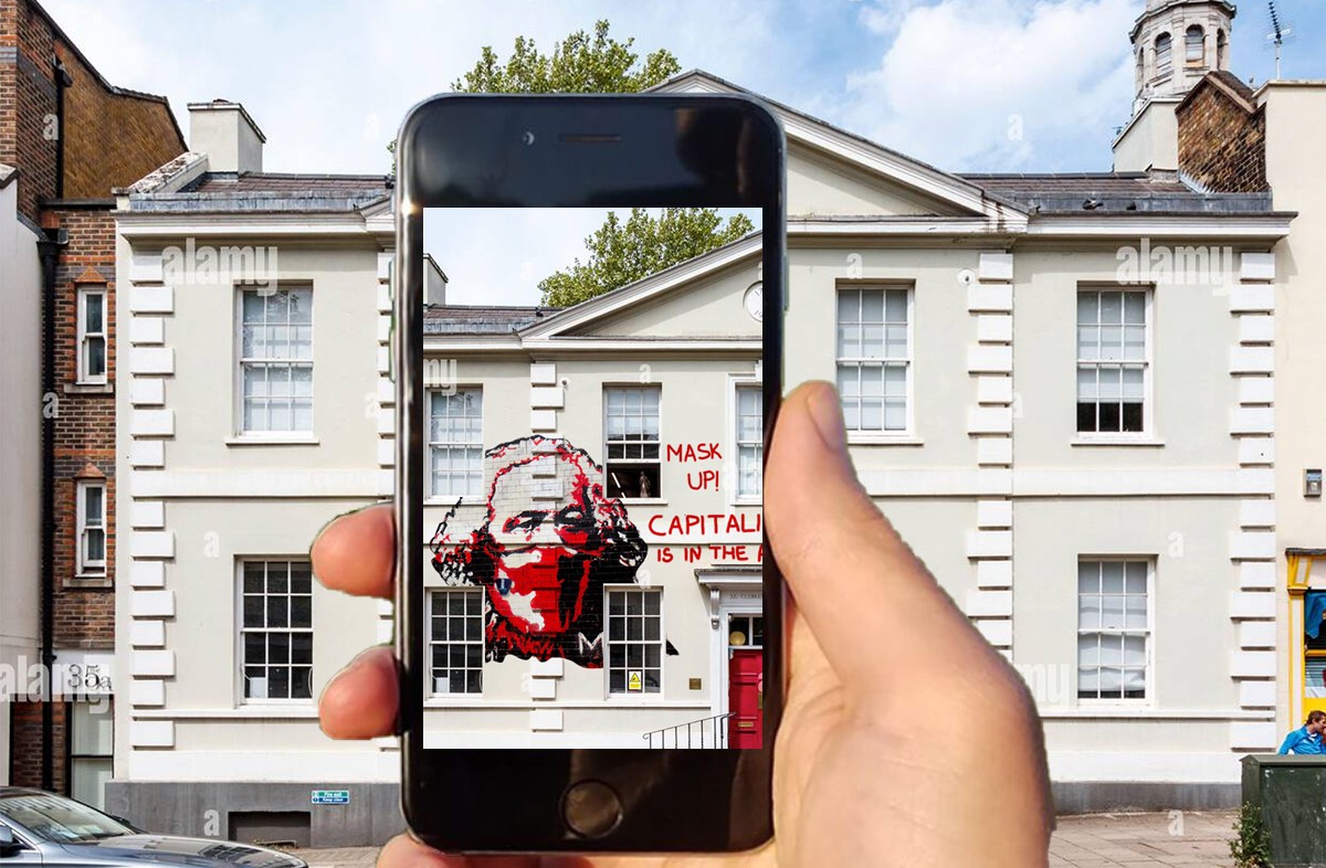
D. The constraint became the concept : AR Graffiti (The "Invisibility" Fix)
Problem: We couldn't paint the Grade II listed building to make it visible. (due to law restrictions)
Solution: We made it scannable. Users point their phone at MML to reveal digital graffiti and hidden voices on their screen making the invisible archive visible without touching the building.
D. The constraint became the concept : AR Graffiti (The "Invisibility" Fix)
Problem: We couldn't paint the Grade II listed building to make it visible. (due to law restrictions)
Solution: We made it scannable. Users point their phone at MML to reveal digital graffiti and hidden voices on their screen making the invisible archive visible without touching the building.
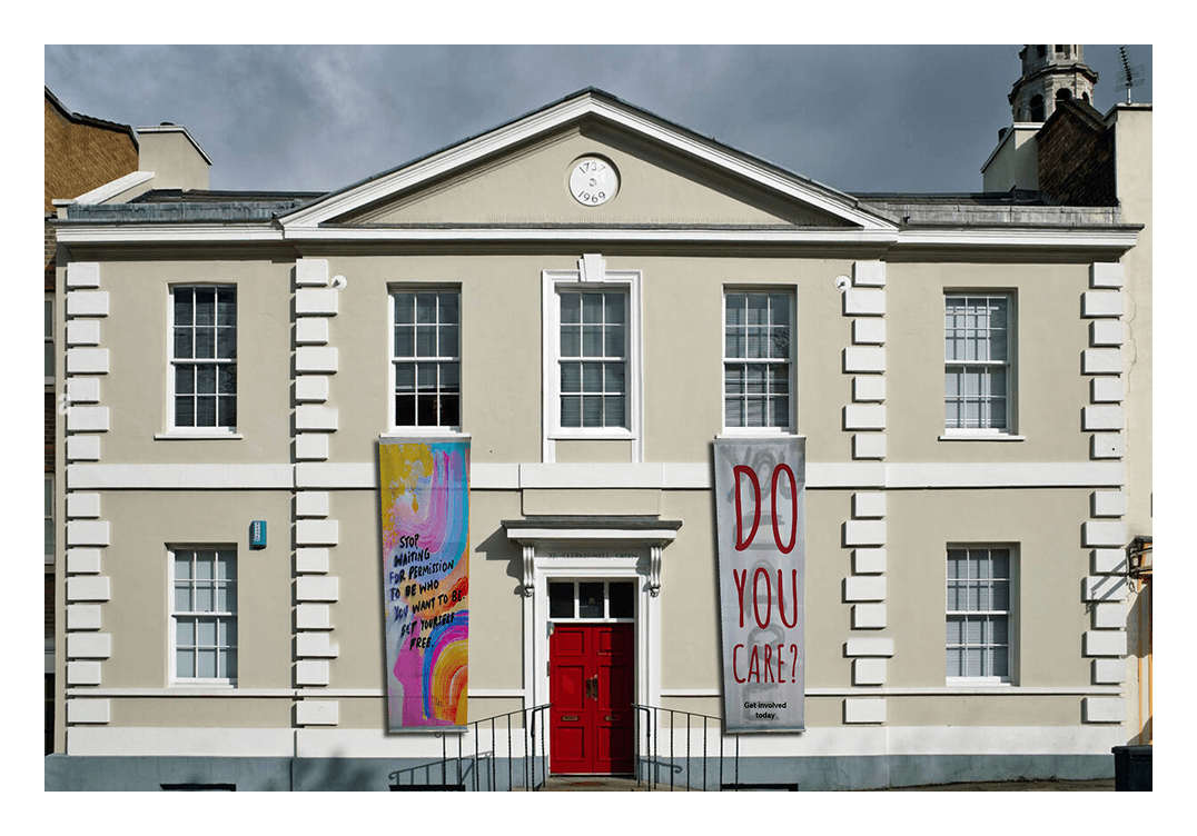
E. When digital isn't enough, make the building speak
Problem: The website could reach people already searching for MML. But what about everyone walking past who had no idea it existed?
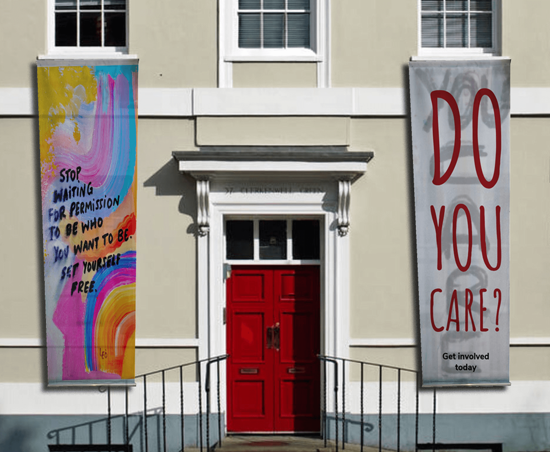
Solution: We proposed a hand-painted translucent tarp hung across the windows bold enough to stop people on the street, transparent enough not to block the listed building's light. Visitors could contribute to it directly, and MML could turn the painting sessions into regular community workshops, making the building itself a participatory archive.
One physical intervention that connects the street, the community, and the digital experience - no planning permission required.
E. When digital isn't enough, make the building speak
Problem: The website could reach people already searching for MML. But what about everyone walking past who had no idea it existed?
Solution: We proposed a hand-painted translucent tarp hung across the windows bold enough to stop people on the street, transparent enough not to block the listed building's light. Visitors could contribute to it directly, and MML could turn the painting sessions into regular community workshops, making the building itself a participatory archive.
One physical intervention that connects the street, the community, and the digital experience - no planning permission required.
Click in the frame once to start interacting, press 'R' to return to the homepage.
Constraints are a brief, not a blocker. The Grade II listing meant we couldn't touch the building physically. That restriction pushed us toward the AR concept a solution we wouldn't have reached without it. The best idea in this project came from a wall we couldn't get past.
Good UX is often about what you remove. The old site had everything and communicated nothing. Flattening the catalogue hierarchy and stripping back the navigation showed me that clarity is a design decision, not a default.
Visual identity is an argument. Every choice the bookshelf logo, the binary typeface pairing, the colour system rooted in revolution and academia had to justify itself against the library's history. Designing for a real institution taught me that aesthetics without rationale is decoration.
If I returned to this project, I'd want to test the AR feature with actual visitors. The concept solved a real constraint but I'd want evidence it solves the right problem before calling it a solution.
Constraints are a brief, not a blocker. The Grade II listing meant we couldn't touch the building physically. That restriction pushed us toward the AR concept a solution we wouldn't have reached without it. The best idea in this project came from a wall we couldn't get past.
Good UX is often about what you remove. The old site had everything and communicated nothing. Flattening the catalogue hierarchy and stripping back the navigation showed me that clarity is a design decision, not a default.
Visual identity is an argument. Every choice the bookshelf logo, the binary typeface pairing, the colour system rooted in revolution and academia had to justify itself against the library's history. Designing for a real institution taught me that aesthetics without rationale is decoration.
If I returned to this project, I'd want to test the AR feature with actual visitors. The concept solved a real constraint but I'd want evidence it solves the right problem before calling it a solution.
You might also like
You might also like
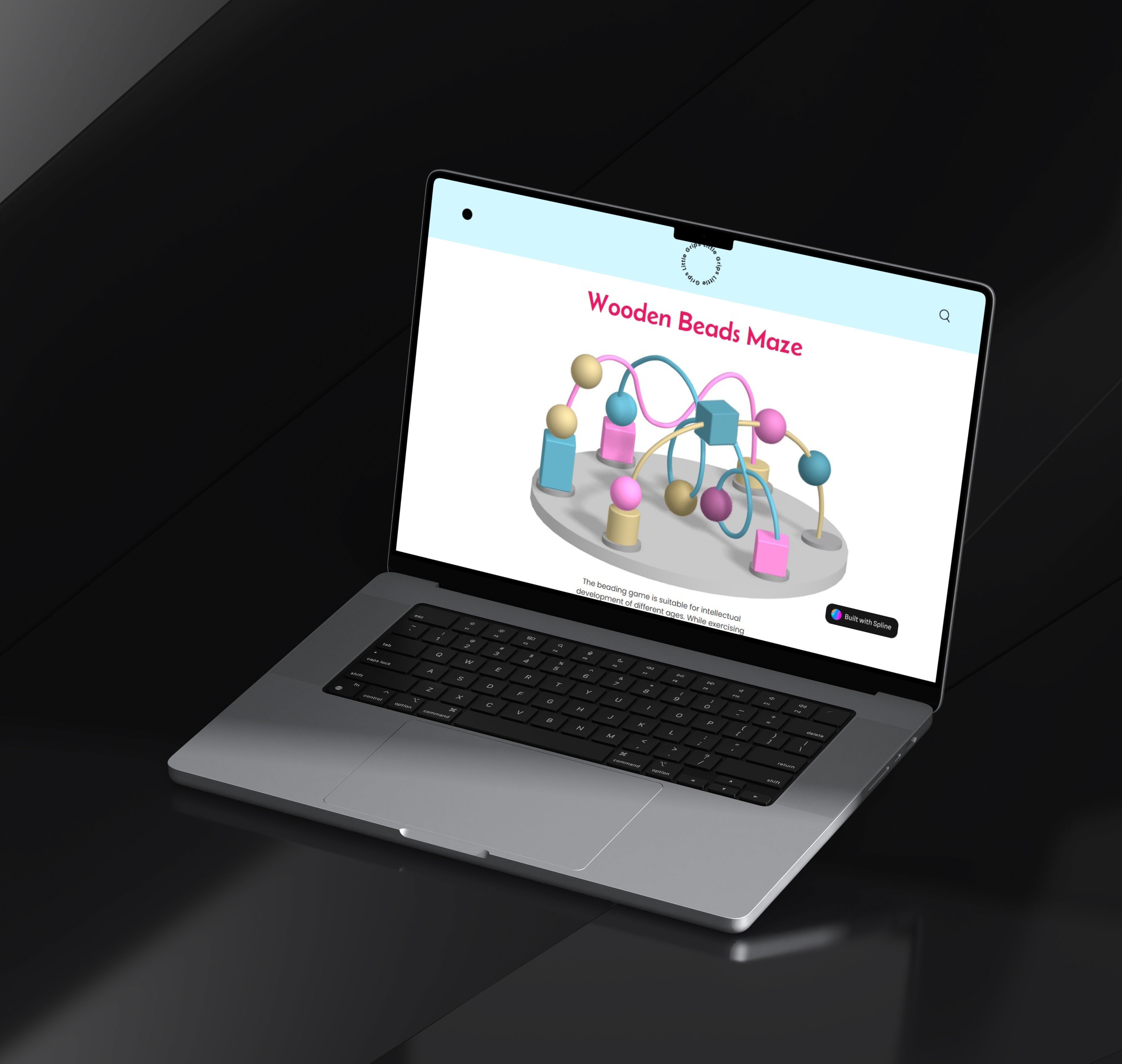
Little Grips: A Digital Play Experience
A digital reimagining of a classic toy that brings tactile play to the digital world, combined with clear visual solutions that help people understand and reduce their plastic footprint.
sustainability
visual design
system mapping
Little Grips: A Digital Play Experience
A digital reimagining of a classic toy that brings tactile play to the digital world, combined with clear visual solutions that help people understand and reduce their plastic footprint.
sustainability
visual design
system mapping
The Tangled Within
A 15-second motion piece symbolising a child’s journey from confusion to clarity through the metaphor of a tangled thread and needle.
motion design
storytelling
layout design
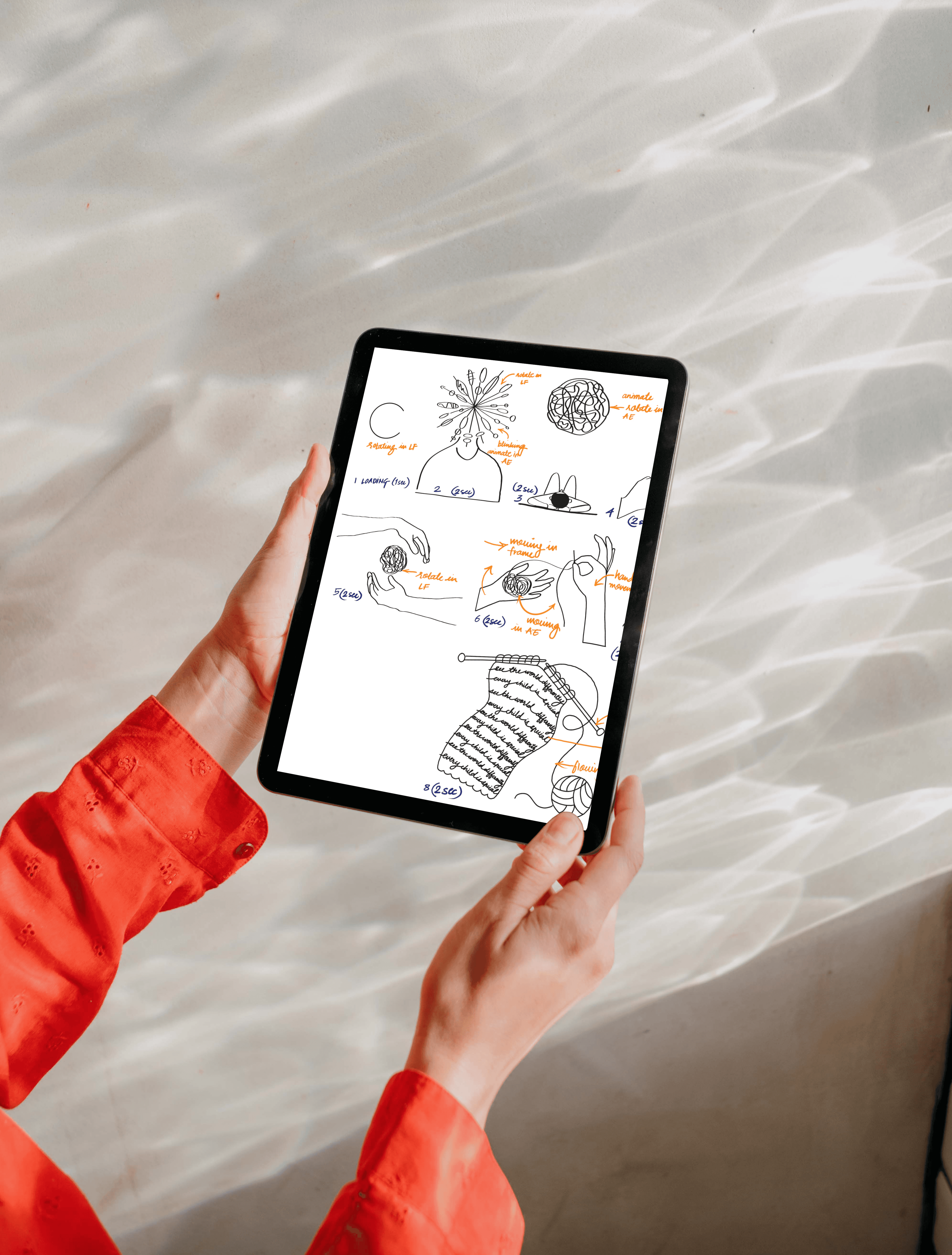
The Tangled Within
A 15-second motion piece symbolising a child’s journey from confusion to clarity through the metaphor of a tangled thread and needle.
motion design
storytelling
layout design