Know her :
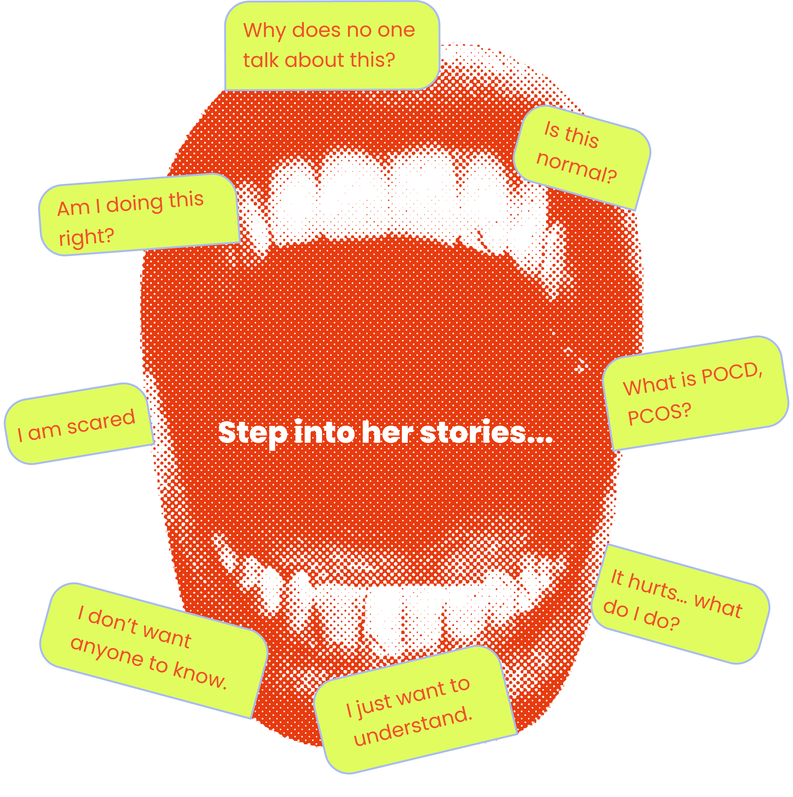
Breaking the silence
Many young girls lack access to clear, positive information about menstruation. I developed Know Her, a gamified educational platform that reframes period education as an engaging journey, empowering students, educators, and single parents through accessible and inclusive design.

Millions of girls reach their first period scared and confused not because information doesn't exist, but because none of it was made for them. Most period apps are clinical, paywalled, and built for adults. Know Her fills that gap: a gamified, story driven platform that replaces medical jargon with play, turning a cultural taboo into a confident first step for girls aged 9-14, their teachers, and single fathers.

Girls aren't scared of their bodies. They're scared because no one gave them a safe way to understand them.
66% of period education is delivered by teachers alone - with no dedicated tools, no training, and no language designed for a 10 year old. Most digital resources that exist are adult centric, clinically written, and paywalled. Cultural taboo fills the silence that education should. Single fathers don't know where to start. And every girl facing her first period is left to figure it out alone.
The gap isn't medical. It's emotional.
"How might we replace shame with confidence - through play?"
3x
Improved brand visibility, hierarchy and clearer navigation :
Increase in how easily visitors identify and understand MML through the new logo, color system, and consistent visual identity.
60%
Reduced effort required to access key informationt :
Streamlined layouts and clearer hierarchy cut information-finding time.

Users

Primary :
Young girls aged 9 and above in schools.

Secondary :
Teachers and visiting health educators who conduct sessions in schools.

Tertiary :
Parents (with special focus on single fathers)
Interviews of users and stakeholders
40 Responses
Below is a summary of key findings:
66% of menstrual education is delivered by teachers or visiting health experts.
60% of teachers prefer external support.
100% confirmed that boys are not included during puberty sessions conducted in schools.
60% would be interested in using a digital platform if it’s child-friendly and easy to use.
To identify industry standards for accessibility and engagement, I audited four direct competitors: Every existing tool had the same blind spot, non of them were built for a girl experiencing her first period.
Comparative Analysis
Here's is a short visualization of what I discovered through my research into current period-tracking apps.
Clue Period, ovulation tracker
- Written in a more medical manner
- No chat feature
- Highly anticipates a premium upgrade to access it
- Adult content only - teen target not be ready for
- No child safe mode or guardian features
Flo Period & ovulation tracker
- Overwhelming, due to large no
- of features & information
- Limited community feature
- Auto generated chart
- Lengthy process to go in after information
- Bombarded with all sort of other notifications multiple times a day
- Cluttered
- Focused on adult-centric
- Requires frequent manual input
My Calendar
- Consultation added in a premium feature
- UX support for diverse user groups: PCOS, PCOD, young girls
Fitbit Health & Fitness
- Only accessible for Fitbit devices
- Requires hardware purchase to use the app
Easy Period Life Tracker
- Basic tracking
- No parental mode
- No education content
Persona Insights
I spoke with students, teachers, and parents. What they told me reshaped the entire design direction fear and cultural shame were bigger barriers than missing information. That's when I stopped designing a health tool and started designing a safe space. The voiceover came from the same insight: if the words on screen feel clinical, younger users simply switch off.


User Journey Mapping
I mapped there emotional arc from fear to confidence then designed each gamified level to step in exactly where anxiety peaks.

Affinity Mapping
I used affinity mapping to organize all my research into simple groups. By looking at all my notes and interviews together, I realized that the biggest problems weren't just a lack of facts, but also cultural shame and a lack of age-appropriate tools. This helped me stop feeling overwhelmed by data and clearly see exactly what features I needed to build.
I used this Problem Clarity chart to decide which features were most important to build first. By mapping ideas based on their impact on the user and my confidence in them. This helped me focus my research on what truly helps girls like easy to understand explanations rather than wasting time on complex features that might be too confusing.
Major Insights & Findings
Girls don't need more information about their bodies they need a space that feels safe enough to receive it. Soft visuals, familiar language, and play-based learning don't just make the experience friendlier; they dismantle the shame that blocks learning in the first place. This became the central principle behind every design decision in Know Her.
Every feature started as a question: what would make a girl feel safe enough to stay?
Early ideation explored quizzes, QR code reveals, AR storytelling, and a resource library spanning books, articles, and podcasts. The visual direction emerged from the same instinct organic flowing shapes, bold fonts, and asymmetric layouts to signal that this wasn't a clinical space. Conversation had to feel built in, not bolted on.

Lo-Fidelity
Lo-fi wireframes mapped the full user flow from onboarding through all 4 game levels to community and support. Every structural decision was made here before any visual design began.

Why game?
Learning through games
Games don't just make learning fun they make it feel safe. A girl navigating a maze isn't thinking about shame; she's thinking about the next move. That shift in mental state was the whole point.
Four levels. One journey. Know Her moves from body basics to real-world preparation ending not with a score, but with a conversation. Every level was designed to leave a girl feeling more ready than when she arrived. The maze, the musical lesson, the cycle explorer, the product match each one a stepping stone, not a lesson.
Click in the frame once to start interacting, press 'R' to return to the homepage.
The black buttons on the right are your entry points each one opens the story behind the game research, personal inspirations, and design choices behind every game mechanic.
Click the Level buttons on the right to reveal the 'Why' behind the design and my research process.


Closing reflection : I started designing an educational tool. I ended up designing a feeling : the feeling that it's safe to know.
What I learned : Designing for shame requires more empathy than designing for function. AI voiceover wasn't a feature add on it became the most inclusive design decision I made. Play isn't decoration. It's the whole strategy.
If I had more time : Test with schools in the UK and India to validate across cultural contexts. Add a dedicated teacher dashboard with session-ready resources. Build the parent mode into a fully standalone experience
You might also like

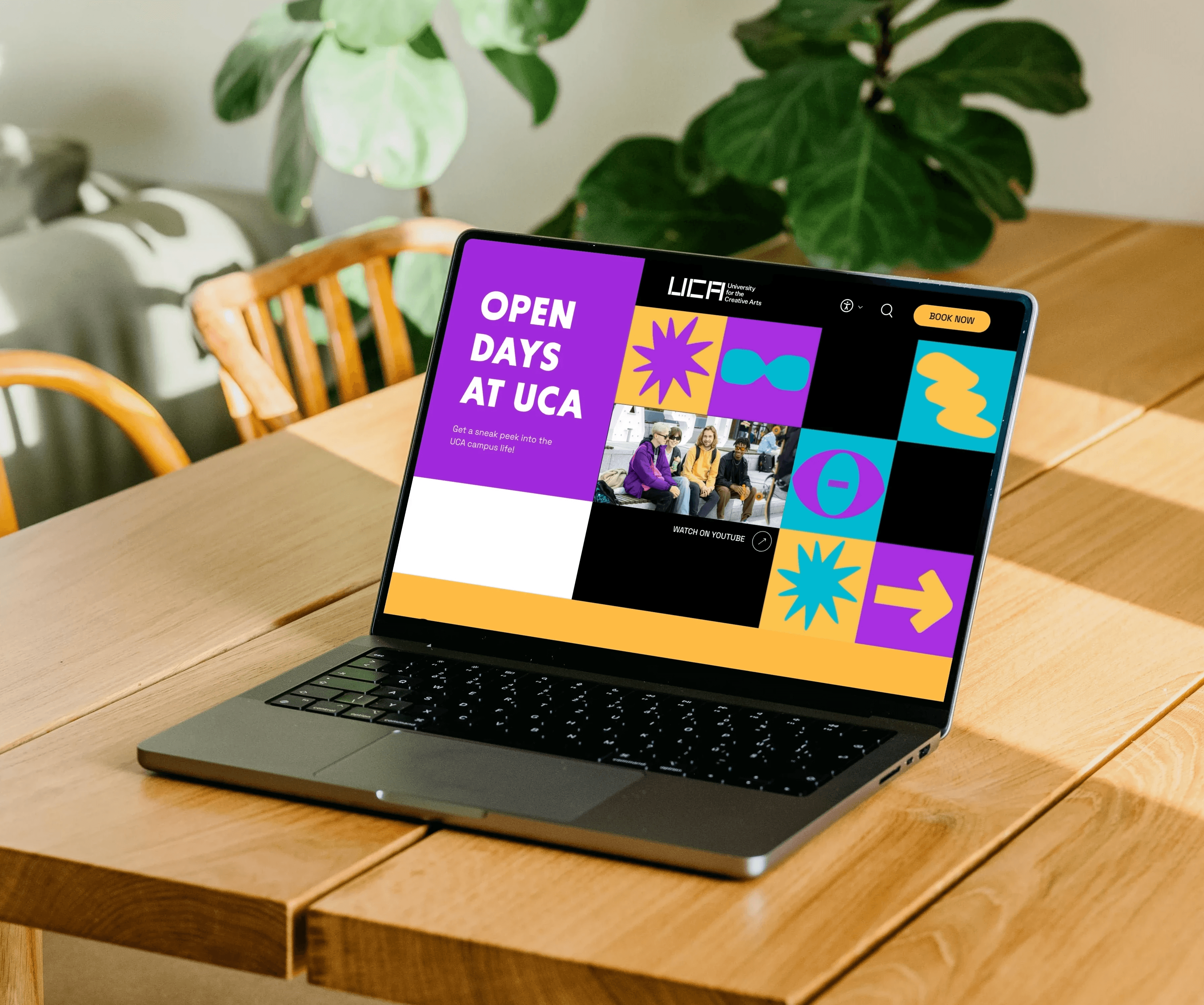
Open Day Website Redesign
Improved the visitor journey by reducing information-finding time by 60% through an intuitive map design and a clear visual hierarchy that simplified campus navigation.
Education
WAY FINDING
service design

Marx Memorial Library
A real client project to solve MML’s low visibility by redesigning its branding to engage younger audiences while respecting its history.
REAL client
branding
visual design
